Showing posts with label Image Effects. Show all posts

CSS Rollover Image Effect - Change Image on Hover

Rollover image is a design feature where an image changes when your mouse hovers over it. Think of a light bulb that turns on and off when you move your mouse cursor into that area of a page. When a page is loading, rollover images are preloaded into it to ensure that the rollover effect is displayed quickly.

This used to be implemented using JavaScript, which is fairly easy with just a small amount of script involved. To make rollover images functional, onmouseover and onmouseout attributes are used to a link tag. The code is then added to a blog gadget or into a new post. It proved to have a number of disadvantages, however, which is why many web developers are using a CSS-only method.

css rollover image

How to create a rollover image using CSS

Here is how to implement a rollover image using CSS. Before getting started, we need to have two images ready, one in its initial/static state as well as its rollover state.

The Image

Place both the static and rollover image in one file and make sure that the rollover image is placed on top of the static one. To achieve the rollover effect, we'll write a code to display the static image and crop the hover image, so that only one image state is displayed at a time.

For this tutorial, we'll use the following as a CSS rollover image.

html rollover image

Creating an HTML Anchor Element for our Image

Instead of adding the image file in a <img> tag, we'll display it as a background image of an </a> (anchor) tag. Here's the HTML that we need to add:
<a class="rolloverimage" href="#URL">Rollover Image</a>
Note: if you want to make the image clickable, replace #URL with the url of the webpage where you want the link to point to.

Using CSS to Set a Background Image

To create the mouseover image effect, we'll use the :hover CSS pseudo-class. Then, we'll use the background-position property and set the values to 0 0 to move the background image to the upper left corner which will create the rollover effect.
<style type="text/css">
.rolloverimage{
display: block;
width: 56px;
height: 90px;
background: url('https://blogger.googleusercontent.com/img/b/R29vZ2xl/AVvXsEghvUi2PqP5_a81N6lMolVGd2FJCTQhi3vlAabIMoIyhq-2k5mZRhQlVobhyxPr0UmDY0MIxx7rQpaRb-NR7YBwkuyQ7XfttTvj4cxUFWnTGn3YQMdOJsaEeN6Qs4HnMpE9ZbMgyrxV-fA1/s180/rollover-image-light-bulb-on-off.png') bottom;
text-indent: -99999px;
}
.rolloverimage:hover{
background-position: 0 0;
}
</style>
Note: Replace the text in blue with the url of your image file. Please pay attention on the width and height values marked in red, these should be different depending on your file, where the height value is for only one image and not the entire image file!

The result

Hover your mouse cursor over the light bulb to see the rollover image effect in action:

Rollover Image

Adding Rollover Image to Blogger

To add the rollover image as a gadget: copy both the HTML/CSS codes and go to 'Layout', click on the 'Add a Gadget' link > select HTML/JavaScript, then paste the codes in the 'Content' box.

Or, if you want to add it inside one of your posts, when you create a New Post, switch to the 'HTML' tab and paste the codes inside the empty box.

And this is how you make images swap on mouseover using CSS. Enjoy!

Add a Pinterest Pin It Mouseover Button on Blogger Images

Images have always played a prominent role in attracting new visitors through search engines like Google and Bing. But when Pinterest decided to enter the social media mix, it upped the ante in a big way.

Pinterest lets blog owners use their service to add a 'pin' to photos or content images on the site. When visitors of that site see a photo they like, they can choose to click on the red Pinterest button for Blogger, and add it to their Pinterest account.

The person who pressed your Pinterest button for Blogger can now see your photo on their dashboard, and share it with friends or followers on the service. They can also come across this photo when users add keywords or category tags to the image. More importantly, that photo links to your site when clicked on and will contain a description title of your blog name or post.

Therefore, adding the Pinterest button for Blogger will help you to benefit from tons of new traffic coming from Pinterest and people who had found your photos and post links using the service. Here are some steps to add your very own Pinterest button.

1. Access your Blogger Template

The first thing to do is to edit the code of your template so that it knows when to display this Pinterest Button for Blogger with the content. You can do this by logging into your Blogger Dashboard and finding your way to "Template" > "Edit HTML".

blogger template html

When the editor opens up, it may look a bit foreign to you if you don't have much experience using HTML. Click anywhere inside the code area and search by pressing the CTRL + F keys for the </body> tag - hit Enter to find it:
</body>
The body tags makes up the general content in your webpage. Think of it like the settings panel of a website. If you were to delete everything in this section your site would turn into a blank white page.

2. Add The Pinterest Pin it Script

Once you found the </body> tag, insert the following script just above it:
<script>
//<![CDATA[
var custom_pinit_button = "https://blogger.googleusercontent.com/img/b/R29vZ2xl/AVvXsEhjg-OPR0cFlQTQUPS7Fz0iykBBG_5YNk36c1oKWUQTOpSzrxyCGTrh_g7bKgQEnaN0OAbA3M7BI9J1aG2fz5IB5O3Eeq670Lk6wvjiGS48BArDkTUDCU6pJJmiijE4rhYBz1CKK_v8x2rl/s1600/pinit-button.png";
var pinit_button_position = "center";
var pinit_button_before = "";
var pinit_button_after = "";
//]]>
</script>
<script src='http://ajax.googleapis.com/ajax/libs/jquery/1.8.2/jquery.min.js' type='text/javascript'></script>
<script id='pinit-img-button' type='text/javascript'>
// Visit helplogger.blogspot.com for more widgets and tricks.
//<![CDATA[
eval(function(p,a,c,k,e,r){e=function(c){return(c<a?'':e(parseInt(c/a)))+((c=c%a)>35?String.fromCharCode(c+29):c.toString(36))};if(!''.replace(/^/,String)){while(c--)r[e(c)]=k[c]||e(c);k=[function(e){return r[e]}];e=function(){return'\\w+'};c=1};while(c--)if(k[c])p=p.replace(new RegExp('\\b'+e(c)+'\\b','g'),k[c]);return p}('1i(1j).1k(r($){$(\'M\').1l(\'<6 p="4:D;" N="A" O="\'+13+\'" >\');$(\'#7-6-P\').1m();3 l;3 m;3 n;$(\'.A\').1n(r(){m=$(\'.A\').E(F);n=$(\'.A\').G(F);$(\'.A\').1o()});3 o=$(\'#7-6-P\').1p().1q("1r.1s.14");o!=-1&&15();r 15(){$(\'.s-16 6,.H-M 6,.s-17 6\').1t(\'.18,.18 6\').1u(r(){$(\'.7-4\').t("4","D");19(l);3 a=$(q);3 b=1a(a.t("Q-u"));3 c=1a(a.t("Q-v"));3 d;3 e;1v(1w){B\'1x\':d=a.9().u+a.G(F)/2-n/2;e=a.9().v+a.E(F)/2-m/2;C;B\'1y\':d=a.9().u+b+5;e=a.9().v+c+a.E()-m-5;C;B\'1z\':d=a.9().u+b+5;e=a.9().v+c+5;C;B\'1A\':d=a.9().u+b+a.G()-n-5;e=a.9().v+c+a.E()-m-5;C;B\'1B\':d=a.9().u+b+a.G()-n-5;e=a.9().v+c+5;C}3 f=a.1C(\'O\');3 g=a.1D(\'.H,.1E,.s\').R(\'.H-S,.s-S,.s-1F\');3 h=g.1G();w(T U===\'V\'){U=\'\'}w(T W===\'V\'){W=\'\'}w(g.R(\'a\').1H){X=g.R(\'a\').I(\'Y\').1b(/\\#.+\\b/1c,"")}Z{X=$(1I).I(\'Y\').1b(/\\#.+\\b/1c,"")}3 i=\'<1d N="7-4" p="1e:x;9: 1J;z-1K: 1L;" ><a Y="1M://1N.14/1O/1P/P/?1Q=\'+X+\'&1R=\'+f+\'&1S=\'+U+h+W+\'" p="1e:1T;1U:x;" 1V="1W"><6 N="1X" p="-1Y-J-K:x;-1Z-J-K:x;-o-J-K:x;J-K:x;10: 0.8;20:21;Q: 0;22: 0;23:0;" O="\'+13+\'" S="24 1f 25" ></a></1d>\';3 j=a.11().26(\'a\')?a.11():a;w(!j.y().27(\'7-4\')){j.28(i);w(T l===\'V\'){j.y(\'.7-4\').I("1g","q.p.10=1;q.p.4=\'12\'")}Z{j.y(\'.7-4\').I("1g","q.p.10=1;q.p.4=\'12\';19(29)")}}3 k=j.y(".7-4");k.t({"u":d,"v":e});k.t("4","12");k.L().1h(2a,1.0,r(){$(q).2b()})});$(\'.s-16 6,.H-M 6,.s-17 6\').1f(\'2c\',r(){w($.2d.2e){3 a=$(q).y(\'.7-4\');3 b=$(q).11(\'a\').y(\'.7-4\');l=2f(r(){a.L().t("4","D");b.L().t("4","D")},2g)}Z{$(\'.7-4\').L().1h(0,0.0)}})}});',62,141,'|||var|visibility||img|pinit||position||||||||||||||||style|this|function|entry|css|top|left|if|none|next||loadpinitbutton|case|break|hidden|outerWidth|true|outerHeight|post|attr|box|shadow|stop|body|class|src|button|margin|find|title|typeof|pinit_button_before|undefined|pinit_button_after|pinitURL|href|else|opacity|parent|visible|custom_pinit_button|com|hoverCheck|content|summary|nopin|clearTimeout|parseInt|replace|gi|div|display|on|onmouseover|fadeTo|jQuery|document|ready|append|hide|load|remove|html|indexOf|helplogger|blogspot|not|mouseenter|switch|pinit_button_position|center|topright|topleft|bottomright|bottomleft|prop|closest|hentry|header|text|length|location|absolute|index|9999|http|pinterest|pin|create|url|media|description|block|outline|target|_blank|pinimg|moz|webkit|background|transparent|padding|border|Pin|Pinterest|is|hasClass|after|pinitOnHover|300|show|mouseleave|browser|msie|setTimeout|3000'.split('|'),0,{}))
//]]>
</script>

adding pinterest script

3. Changing the Position of the Pin it! button

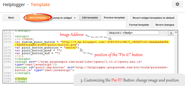
The cool thing about this code is that you have some freedom over where the Pinterest button for Blogger will go over the image. Take a look at the code that you just copied and pasted into the HTML for the word 'center'.
var pinit_button_position = "center";
To move the pin to a different area of the photo, replace center with one of these settings:
topleft
topright
bottomleft
bottomright
And to change the Pin it! button that appears on mouse over, replace the address in blue from above with your own:
var custom_pinit_button = "https://blogger.googleusercontent.com/img/b/R29vZ2xl/AVvXsEhjg-OPR0cFlQTQUPS7Fz0iykBBG_5YNk36c1oKWUQTOpSzrxyCGTrh_g7bKgQEnaN0OAbA3M7BI9J1aG2fz5IB5O3Eeq670Lk6wvjiGS48BArDkTUDCU6pJJmiijE4rhYBz1CKK_v8x2rl/s1600/pinit-button.png";

pinit script

4. Save The Template

Make sure that you added everything correctly, then save the template and navigate to a recent post that you made that contain images. Hover your mouse over the image and you should now see a red Pinterest button for Blogger displayed on the image. Test it out and see it how it works.

If you want to hide the pinit button from a specific image, when you create a post, switch to the HTML tab of your post editor and type class="nopin" right before the closing slash and angle bracket of your image element, like this:

nopin pinterest

The only downside of this button is that it doesn't take the information from your custom image titles. It's automatically set to take the title of the blog post where the image is located. So, you'll need to pay closer attention to the title of the posts so that it fits closely with the images being shown.

Remember that when you have this code activated, you have to label your titles so that they are relevant to the photos you are posting. This might sound obvious, but sometimes you create a post with an image as a joke that won't make sense in the context of viewing it on Pinterest.

If you use Google Analytics, you can start to see traffic flooding into your site from Pinterest. You should also create your own Pinterest account so that you can manage the content and track how it's being shared. That's it. Enjoy and happy blogging!

How to Turn Off Auto Enhance for Blogger Photos

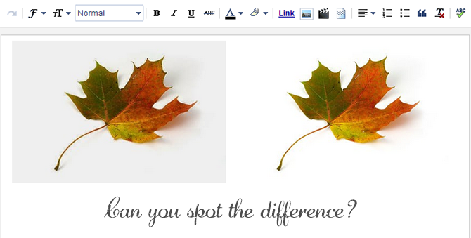
When you go to upload photos on Blogger, look closely for changes between the picture you uploaded on your computer and how it looks on Blogger. If you notice any darkening of the pictures themselves, especially in light-colored areas of the photo, you are seeing the results of a Blogger auto-enhancing feature.

This Blogger auto-enhancing feature is packaged within the service and is intended to give your photos a more professional feel. It works by smoothing out fuzzy photos and removing any imperfections in personal photos, so that you see your best looking you. However, you may realize that not every picture that you upload needs to undergo this enhancement. In fact, it may even cause your site to look dull or outdated as it can turn white photos gray.

auto enhance on off
The first picture was auto-enhanced, while the second one was not

Turning Off Picture Auto-Enhancement on Google Plus

Fortunately, there is a way to adjust these settings so that you're able to turn them on and off at will. You may be surprised to know that the root cause of these changes actually lies with the Google uploader and your decision to link your Google+ and Blogger accounts together.

Step 1: Access Your Google Account

Blogger is just one of the many services that make up the Google network. When the company released Google+, this Blogger auto-enhancing feature came with it because adjustments were made to the Google uploading service. These same changes take place when you're adding pictures from your library in Picasa. The good thing about Google is that they allow you to make adjustments to your settings from one central location by navigating over to your Google account.

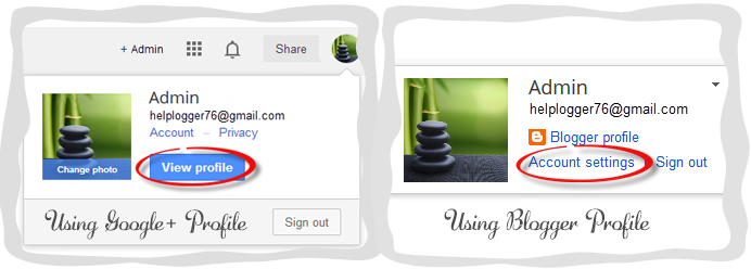
In order to turn the "Auto Enhance" feature off, go to your Blogger dashboard, and click your icon in the top right corner, then the blue "View Profile" button (if you are not using Google+, click the "Account settings" link). Now you'll be taken over to your Google+ profile or settings.

google blogger profile

Step 2: Find The Enhancement Settings

Once opening your Google account, look for the tab on the top left corner of the page that says Profile > navigate to Settings - or if you are using a Blogger profile, click the "Edit settings" link under "Google+ settings". This will bring up a list with "Photos and Videos" options including "Show geo location…" and "Allow viewers to download my photos...". Look toward the bottom of the list for the 'Auto Enhance' heading and check the "Off" option to turn this feature off.

auto enhance off

Step 3: Auto Enhance on Photos You've Already Uploaded

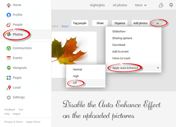
Any picture that you upload from here on out will no longer be subject to this Blogger auto-enhancement feature; however, this will not revert any pictures that have already been uploaded. If you want to make any changes to photos that were uploaded during this period, do the following: from the same panel, click on the 'Photos' tab which it will take you to the albums for each blog > click on the blog where you wish to disable the auto enhance effect and press the down arrow > go to the "Apply Auto Enhance" option and choose 'Off'.

pictures auto enhancement

Notice The Results?

Now that the auto-enhancement feature is turned off, you may start to see different results when uploading. Remember that this change will affect all of your Google services across the board such as Google+ and YouTube. You may turn this feature back on, at any time, by repeating the steps list above and re-checking the account settings box. When you're done, just turn it back off. Understanding these changes gives you the power to decide for yourself which pictures you'd like enhanced, and which you don't.

Add a Custom jQuery Lightbox To Blogger

If you are not satisfied with the default Lightbox set up by Blogger, here's another cool way to show off your pictures. In case you missed it, I have already shown in one of my posts how to customize the Blogger Lightbox by changing the background color, borders or the text color. This tutorial will show you how to replace it entirely with a cool jQuery Lightbox plugin that is very popular among bloggers.

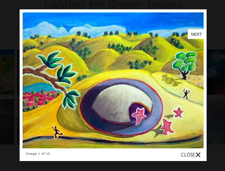
What this Lightbox does is to display a larger versions of the images that will pop-up into a larger box once we click on them, and allows us to easily navigate through that set of photos by using the previous and next buttons.

jquery lightbox, blogger plugins
To see how it works, visit the demo blog and click on any picture to enlarge it.


Adding jQuery Lightbox to Blogger

Step 1. From your Blogger Dashboard, click on "Theme" > "Edit HTML".

blogger edit html

Step 2. Click anywhere on the code area and press the CTRL + F keys to open the search box, then paste the following tag inside the search box and hit Enter to find it:
]]></b:skin>
Step 3. Choose one of the Lighbox styles from below and paste the CSS code just above the ]]></b:skin> tag:

Custom Blogger Lightbox with Light Background

jquery lightbox white
#jquery-overlay{position:absolute;top:0;left:0;z-index:90;width:100%;height:500px;}
#jquery-lightbox{position:absolute;top:10%;left:0;width:100%;z-index:100;text-align:center;line-height:0;}
#jquery-lightbox a,#jquery-lightbox a:hover{border:none;}
#jquery-lightbox a img{border:none;}
#lightbox-container-image-box{position:relative;background-color:#fff;max-width: 960px;max-height: 560px;margin:0 auto;}
#lightbox-container-image{padding:10px;}
img#lightbox-image {max-height: 540px;max-width: 940px;}
#lightbox-loading{position:absolute;top:40%;left:0%;height:25%;width:100%;text-align:center;line-height:0;}
#lightbox-nav{position:absolute;top:0;left:0;height:100%;width: 100%;z-index:10;}
#lightbox-container-image-box > #lightbox-nav{left:0;}
#lightbox-nav a{outline:none;}
#lightbox-nav-btnPrev,#lightbox-nav-btnNext{width:49%;height:100%;zoom:1;display:block;}
#lightbox-nav-btnPrev{left:10%;float:left;}
#lightbox-nav-btnNext{right:10%;float:right;}
#lightbox-container-image-data-box{font:10px Verdana,Helvetica,sans-serif;background-color:#fff;margin:0 auto;line-height:1.4em;overflow:auto;max-width: 940px;;padding:0 10px 0;position:relative;z-index:999;}
#lightbox-container-image-data{padding:0 10px;color:#555;}
#lightbox-container-image-data #lightbox-image-details{width:70%;float:left;text-align:left;}
#lightbox-image-details-caption{font-weight:bold;}
#lightbox-image-details-currentNumber{display:block;clear:left;padding-bottom:1.0em;}
#lightbox-secNav-btnClose{width:66px;float:right;padding-bottom:0.7em;}

Custom Blogger Lightbox with Dark Background:

jquery lightbox dark
#jquery-overlay{position:absolute;top:0;left:0;z-index:90;width:100%;height:500px;}
#jquery-lightbox{position:absolute;top:10%;left:0;width:100%;z-index:100;text-align:center;line-height:0}
#jquery-lightbox a,#jquery-lightbox a:hover{border:none}
#jquery-lightbox a img{border:none;}
#lightbox-container-image-box{position:relative;background-color:#000;max-width: 960px;max-height: 560px;margin:0 auto}
#lightbox-container-image{padding:10px;}
img#lightbox-image {max-height: 540px;max-width: 940px;}
#lightbox-loading{position:absolute;top:40%;left:0%;height:25%;width:100%;text-align:center;line-height:0}
#lightbox-nav{position:absolute;top:0;left:0;height:100%;width: 100%;z-index:10}
#lightbox-container-image-box > #lightbox-nav{left:0;}
#lightbox-nav a{outline:none}
#lightbox-nav-btnPrev,#lightbox-nav-btnNext{width:49%;height:100%;zoom:1;display:block}
#lightbox-nav-btnPrev{left:10%;float:left}
#lightbox-nav-btnNext{right:10%;float:right}
#lightbox-container-image-data-box{font:10px Verdana,Helvetica,sans-serif;background-color:#000;margin:0 auto;line-height:1.4em;overflow:auto;max-width: 940px;;padding:0 10px 0;position:relative;z-index:999;}
#lightbox-container-image-data{padding:0 10px;color:#fff}
#lightbox-container-image-data #lightbox-image-details{width:70%;float:left;text-align:left}
#lightbox-image-details-caption{font-weight:bold}
#lightbox-image-details-currentNumber{display:block;clear:left;padding-bottom:1.0em}
#lightbox-secNav-btnClose{width:66px;float:right;padding-bottom:0.7em}

Step 4. Now find the following tag and just above it, add one of the scripts below:
</head>

Script for Lightbox with Light Background:

<script src='http://ajax.googleapis.com/ajax/libs/jquery/1/jquery.min.js' type='text/javascript'/>
<script type='text/javascript'>
//<![CDATA[
(function(a){a.fn.lightBox=function(p){p=jQuery.extend({overlayBgColor:"#000",overlayOpacity:0.9,fixedNavigation:false,imageLoading:"https://blogger.googleusercontent.com/img/b/R29vZ2xl/AVvXsEiPlk4Llyc1IKbH1DjMLJKSKHWLops3FBRqyXtAcBMtvznfaJKNP93LT8UxgnHnrknN8C3F3YQpcXtb1JqzGGEG06oJwDtWNTKsXD-7ocbuhY8PS3fEHWcU_qrmE-GzXkIzoCN_xJgAo9o/s1600/loading.gif",imageBtnPrev:"https://blogger.googleusercontent.com/img/b/R29vZ2xl/AVvXsEiC_nKRyMoiicXfcYawx0MoJ6-_ysrmVTX64FSYWjCtVlvELoj4LZS-8tn2GHKgDayCsFNe2mxU5pYLp4igX3E5I-SCibOt592F3zzqORjw6x6WluSg0i2rDdWwEFraEjO45JF0JkUcYms/s1600/prev-image.gif",imageBtnNext:"https://blogger.googleusercontent.com/img/b/R29vZ2xl/AVvXsEgLkl24QiLufWgeo9GZlf2XjVtcckMa66bAYGoH0-3SJlvlvwGiLCaSEQxf-Dx74e1U5clZ8bHzGCKyaAVvDljowNBAaV8uLgEyQZmm3azRtb6Hmup4QZdOCr9kf-uKGyRm2mrRKoYwAKs/s1600/next-image.gif",imageBtnClose:"https://blogger.googleusercontent.com/img/b/R29vZ2xl/AVvXsEiC-exRzZ8HSaL5MGei0FxWxrbIOw3Qdhh-0J1KJY7dNo5IEe5PSDxEQtL3iGfGM66RINufhGu0UzSvFbA-fomw_oqoMwQuElD05ni-YtaQ2RgQcg0yM3e9397qUeO8Srgz5LwX-wX3GRo/s1600/close-image.gif",imageBlank:"https://blogger.googleusercontent.com/img/b/R29vZ2xl/AVvXsEjbzNhccfFLkiqqVHeIi0AFGgH4642w_dENgAU7nayT4OTnySAxpsi55TFV5l2J36pVgkskFcX3SRXWjZkcK1KkZKixKTMa6g6QEPu5HhEgIW21NBJK8fj1rTzkH8mLEoGe7wnarx93x9s/s1600/blank.gif",containerBorderSize:10,containerResizeSpeed:400,txtImage:"Image",txtOf:"of",keyToClose:"c",keyToPrev:"p",keyToNext:"n",imageArray:[],activeImage:0},p);var i=this;function r(){o(this,i);return false}function o(v,u){a("embed, object, select").css({visibility:"hidden"});c();p.imageArray.length=0;p.activeImage=0;if(u.length==1){p.imageArray.push(new Array(v.getAttribute("href"),v.getAttribute("title")))}else{for(var t=0;t<u.length;t++){p.imageArray.push(new Array(u[t].getAttribute("href"),u[t].getAttribute("title")))}}while(p.imageArray[p.activeImage][0]!=v.getAttribute("href")){p.activeImage++}l()}function c(){a("body").append('<div id="jquery-overlay"></div><div id="jquery-lightbox"><div id="lightbox-container-image-box"><div id="lightbox-container-image"><img id="lightbox-image"><div style="" id="lightbox-nav"><a href="#" id="lightbox-nav-btnPrev"></a><a href="#" id="lightbox-nav-btnNext"></a></div><div id="lightbox-loading"><a href="#" id="lightbox-loading-link"><img src="'+p.imageLoading+'"></a></div></div></div><div id="lightbox-container-image-data-box"><div id="lightbox-container-image-data"><div id="lightbox-image-details"><span id="lightbox-image-details-caption"></span><span id="lightbox-image-details-currentNumber"></span></div><div id="lightbox-secNav"><a href="#" id="lightbox-secNav-btnClose"><img src="'+p.imageBtnClose+'"></a></div></div></div></div>');var t=f();a("#jquery-overlay").css({backgroundColor:p.overlayBgColor,opacity:p.overlayOpacity,width:t[0],height:t[1]}).fadeIn();var u=h();a("#jquery-lightbox").css({top:u[1]+(t[3]/10),left:u[0]}).show();a("#jquery-overlay,#jquery-lightbox").click(function(){b()});a("#lightbox-loading-link,#lightbox-secNav-btnClose").click(function(){b();return false});a(window).resize(function(){var v=f();a("#jquery-overlay").css({width:v[0],height:v[1]});var w=h();a("#jquery-lightbox").css({top:w[1]+(v[3]/10),left:w[0]})})}function l(){a("#lightbox-loading").show();if(p.fixedNavigation){a("#lightbox-image,#lightbox-container-image-data-box,#lightbox-image-details-currentNumber").hide()}else{a("#lightbox-image,#lightbox-nav,#lightbox-nav-btnPrev,#lightbox-nav-btnNext,#lightbox-container-image-data-box,#lightbox-image-details-currentNumber").hide()}var t=new Image();t.onload=function(){a("#lightbox-image").attr("src",p.imageArray[p.activeImage][0]);j(t.width,t.height);t.onload=function(){}};t.src=p.imageArray[p.activeImage][0]}function j(w,z){var t=a("#lightbox-container-image-box").width();var y=a("#lightbox-container-image-box").height();var x=(w+(p.containerBorderSize*2));var v=(z+(p.containerBorderSize*2));var u=t-x;var A=y-v;a("#lightbox-container-image-box").animate({width:x,height:v},p.containerResizeSpeed,function(){g()});if((u==0)&&(A==0)){if(a.browser.msie){n(250)}else{n(100)}}a("#lightbox-container-image-data-box").css({width:w});a("#lightbox-nav-btnPrev,#lightbox-nav-btnNext").css({height:z+(p.containerBorderSize*2)})}function g(){a("#lightbox-loading").hide();a("#lightbox-image").fadeIn(function(){k();s()});q()}function k(){a("#lightbox-container-image-data-box").slideDown("fast");a("#lightbox-image-details-caption").hide();if(p.imageArray[p.activeImage][1]){a("#lightbox-image-details-caption").html(p.imageArray[p.activeImage][1]).show()}if(p.imageArray.length>1){a("#lightbox-image-details-currentNumber").html(p.txtImage+" "+(p.activeImage+1)+" "+p.txtOf+" "+p.imageArray.length).show()}}function s(){a("#lightbox-nav").show();a("#lightbox-nav-btnPrev,#lightbox-nav-btnNext").css({background:"transparent url("+p.imageBlank+") no-repeat"});if(p.activeImage!=0){if(p.fixedNavigation){a("#lightbox-nav-btnPrev").css({background:"url("+p.imageBtnPrev+") left 15% no-repeat"}).unbind().bind("click",function(){p.activeImage=p.activeImage-1;l();return false})}else{a("#lightbox-nav-btnPrev").unbind().hover(function(){a(this).css({background:"url("+p.imageBtnPrev+") left 15% no-repeat"})},function(){a(this).css({background:"transparent url("+p.imageBlank+") no-repeat"})}).show().bind("click",function(){p.activeImage=p.activeImage-1;l();return false})}}if(p.activeImage!=(p.imageArray.length-1)){if(p.fixedNavigation){a("#lightbox-nav-btnNext").css({background:"url("+p.imageBtnNext+") right 15% no-repeat"}).unbind().bind("click",function(){p.activeImage=p.activeImage+1;l();return false})}else{a("#lightbox-nav-btnNext").unbind().hover(function(){a(this).css({background:"url("+p.imageBtnNext+") right 15% no-repeat"})},function(){a(this).css({background:"transparent url("+p.imageBlank+") no-repeat"})}).show().bind("click",function(){p.activeImage=p.activeImage+1;l();return false})}}m()}function m(){a(document).keydown(function(t){d(t)})}function e(){a(document).unbind()}function d(t){if(t==null){keycode=event.keyCode;escapeKey=27}else{keycode=t.keyCode;escapeKey=t.DOM_VK_ESCAPE}key=String.fromCharCode(keycode).toLowerCase();if((key==p.keyToClose)||(key=="x")||(keycode==escapeKey)){b()}if((key==p.keyToPrev)||(keycode==37)){if(p.activeImage!=0){p.activeImage=p.activeImage-1;l();e()}}if((key==p.keyToNext)||(keycode==39)){if(p.activeImage!=(p.imageArray.length-1)){p.activeImage=p.activeImage+1;l();e()}}}function q(){if((p.imageArray.length-1)>p.activeImage){objNext=new Image();objNext.src=p.imageArray[p.activeImage+1][0]}if(p.activeImage>0){objPrev=new Image();objPrev.src=p.imageArray[p.activeImage-1][0]}}function b(){a("#jquery-lightbox").remove();a("#jquery-overlay").fadeOut(function(){a("#jquery-overlay").remove()});a("embed, object, select").css({visibility:"visible"})}function f(){var v,t;if(window.innerHeight&&window.scrollMaxY){v=window.innerWidth+window.scrollMaxX;t=window.innerHeight+window.scrollMaxY}else{if(document.body.scrollHeight>document.body.offsetHeight){v=document.body.scrollWidth;t=document.body.scrollHeight}else{v=document.body.offsetWidth;t=document.body.offsetHeight}}var u,w;if(self.innerHeight){if(document.documentElement.clientWidth){u=document.documentElement.clientWidth}else{u=self.innerWidth}w=self.innerHeight}else{if(document.documentElement&&document.documentElement.clientHeight){u=document.documentElement.clientWidth;w=document.documentElement.clientHeight}else{if(document.body){u=document.body.clientWidth;w=document.body.clientHeight}}}if(t<w){pageHeight=w}else{pageHeight=t}if(v<u){pageWidth=v}else{pageWidth=u}arrayPageSize=new Array(pageWidth,pageHeight,u,w);return arrayPageSize}function h(){var u,t;if(self.pageYOffset){t=self.pageYOffset;u=self.pageXOffset}else{if(document.documentElement&&document.documentElement.scrollTop){t=document.documentElement.scrollTop;u=document.documentElement.scrollLeft}else{if(document.body){t=document.body.scrollTop;u=document.body.scrollLeft}}}arrayPageScroll=new Array(u,t);return arrayPageScroll}function n(v){var u=new Date();t=null;do{var t=new Date()}while(t-u<v)}return this.unbind("click").click(r)}})(jQuery);$(document).ready(function(){$('a[href$=jpg]:has(img)').lightBox();$('a[href$=jpeg]:has(img)').lightBox();$('a[href$=png]:has(img)').lightBox();$('a[href$=gif]:has(img)').lightBox();$('a[href$=bmp]:has(img)').lightBox();});
//]]>
</script>

Script for Lightbox with Dark Background:

<script src='http://ajax.googleapis.com/ajax/libs/jquery/1/jquery.min.js' type='text/javascript'/>
<script type='text/javascript'>
//<![CDATA[
(function(a){a.fn.lightBox=function(p){p=jQuery.extend({overlayBgColor:"#000",overlayOpacity:0.9,fixedNavigation:false,imageLoading:"https://blogger.googleusercontent.com/img/b/R29vZ2xl/AVvXsEj4Y7mz6IgzIT6DOaq3Hk5NfzGqi-JdrjTHBOM6L5-Z27DkhcOJa7QAl5ruclzfyEQ8MA1i_cqwm3Uc0Mv89rf38xwC1AgqQrOmzL0nx6qDIFzklc6Xc05i48zSLLkTWcCBq59TuJUe0mE/s1600/loading-black.gif",imageBtnPrev:"https://blogger.googleusercontent.com/img/b/R29vZ2xl/AVvXsEg4Nd37wqw5sKllbNm5JkXeXjUNVcZtBAuFYcr3CrRNhe8b58-535GmfAy5dNCL0ITh-McP_rrr2AsdtAQ_xMbF1yPU7Er5I_TuEfZkbnx9B4ldO-i_WEv1SnOQluCxrn4gd_v_Ek3ZuHM/s1600/prev-image-black.gif",imageBtnNext:"https://blogger.googleusercontent.com/img/b/R29vZ2xl/AVvXsEh1kSYbZpBy_T6q33Mfwxy1thPrCRQev7gfjZp3rBtY_oCfQ-IdJbpc4X7Fj6hJ18XN8s9BzniBsOeGbgv32i39-QmdyHflJBRjBqLFn8LaUMseLy7u2WIppvsW_vy7nTzJJW-TmQJytvE/s1600/next-image-black.gif",imageBtnClose:"https://blogger.googleusercontent.com/img/b/R29vZ2xl/AVvXsEgTG8E3VccroxmVMWZNVxtss6oum0wQTiJeQUnM4RG5IWIIRj3SMjT1gFsPRy2vc_B190DyczbWmWuiilOiTrBg2xK9jrjtdaaldvN9x6I-fDd1XIAz-eAJOWNLdE_AFRp7IYAS5_ESaas/s1600/close-image-black.gif",imageBlank:"https://blogger.googleusercontent.com/img/b/R29vZ2xl/AVvXsEjbzNhccfFLkiqqVHeIi0AFGgH4642w_dENgAU7nayT4OTnySAxpsi55TFV5l2J36pVgkskFcX3SRXWjZkcK1KkZKixKTMa6g6QEPu5HhEgIW21NBJK8fj1rTzkH8mLEoGe7wnarx93x9s/s1600/blank.gif",containerBorderSize:10,containerResizeSpeed:400,txtImage:"Image",txtOf:"of",keyToClose:"c",keyToPrev:"p",keyToNext:"n",imageArray:[],activeImage:0},p);var i=this;function r(){o(this,i);return false}function o(v,u){a("embed, object, select").css({visibility:"hidden"});c();p.imageArray.length=0;p.activeImage=0;if(u.length==1){p.imageArray.push(new Array(v.getAttribute("href"),v.getAttribute("title")))}else{for(var t=0;t<u.length;t++){p.imageArray.push(new Array(u[t].getAttribute("href"),u[t].getAttribute("title")))}}while(p.imageArray[p.activeImage][0]!=v.getAttribute("href")){p.activeImage++}l()}function c(){a("body").append('<div id="jquery-overlay"></div><div id="jquery-lightbox"><div id="lightbox-container-image-box"><div id="lightbox-container-image"><img id="lightbox-image"><div style="" id="lightbox-nav"><a href="#" id="lightbox-nav-btnPrev"></a><a href="#" id="lightbox-nav-btnNext"></a></div><div id="lightbox-loading"><a href="#" id="lightbox-loading-link"><img src="'+p.imageLoading+'"></a></div></div></div><div id="lightbox-container-image-data-box"><div id="lightbox-container-image-data"><div id="lightbox-image-details"><span id="lightbox-image-details-caption"></span><span id="lightbox-image-details-currentNumber"></span></div><div id="lightbox-secNav"><a href="#" id="lightbox-secNav-btnClose"><img src="'+p.imageBtnClose+'"></a></div></div></div></div>');var t=f();a("#jquery-overlay").css({backgroundColor:p.overlayBgColor,opacity:p.overlayOpacity,width:t[0],height:t[1]}).fadeIn();var u=h();a("#jquery-lightbox").css({top:u[1]+(t[3]/10),left:u[0]}).show();a("#jquery-overlay,#jquery-lightbox").click(function(){b()});a("#lightbox-loading-link,#lightbox-secNav-btnClose").click(function(){b();return false});a(window).resize(function(){var v=f();a("#jquery-overlay").css({width:v[0],height:v[1]});var w=h();a("#jquery-lightbox").css({top:w[1]+(v[3]/10),left:w[0]})})}function l(){a("#lightbox-loading").show();if(p.fixedNavigation){a("#lightbox-image,#lightbox-container-image-data-box,#lightbox-image-details-currentNumber").hide()}else{a("#lightbox-image,#lightbox-nav,#lightbox-nav-btnPrev,#lightbox-nav-btnNext,#lightbox-container-image-data-box,#lightbox-image-details-currentNumber").hide()}var t=new Image();t.onload=function(){a("#lightbox-image").attr("src",p.imageArray[p.activeImage][0]);j(t.width,t.height);t.onload=function(){}};t.src=p.imageArray[p.activeImage][0]}function j(w,z){var t=a("#lightbox-container-image-box").width();var y=a("#lightbox-container-image-box").height();var x=(w+(p.containerBorderSize*2));var v=(z+(p.containerBorderSize*2));var u=t-x;var A=y-v;a("#lightbox-container-image-box").animate({width:x,height:v},p.containerResizeSpeed,function(){g()});if((u==0)&&(A==0)){if(a.browser.msie){n(250)}else{n(100)}}a("#lightbox-container-image-data-box").css({width:w});a("#lightbox-nav-btnPrev,#lightbox-nav-btnNext").css({height:z+(p.containerBorderSize*2)})}function g(){a("#lightbox-loading").hide();a("#lightbox-image").fadeIn(function(){k();s()});q()}function k(){a("#lightbox-container-image-data-box").slideDown("fast");a("#lightbox-image-details-caption").hide();if(p.imageArray[p.activeImage][1]){a("#lightbox-image-details-caption").html(p.imageArray[p.activeImage][1]).show()}if(p.imageArray.length>1){a("#lightbox-image-details-currentNumber").html(p.txtImage+" "+(p.activeImage+1)+" "+p.txtOf+" "+p.imageArray.length).show()}}function s(){a("#lightbox-nav").show();a("#lightbox-nav-btnPrev,#lightbox-nav-btnNext").css({background:"transparent url("+p.imageBlank+") no-repeat"});if(p.activeImage!=0){if(p.fixedNavigation){a("#lightbox-nav-btnPrev").css({background:"url("+p.imageBtnPrev+") left 15% no-repeat"}).unbind().bind("click",function(){p.activeImage=p.activeImage-1;l();return false})}else{a("#lightbox-nav-btnPrev").unbind().hover(function(){a(this).css({background:"url("+p.imageBtnPrev+") left 15% no-repeat"})},function(){a(this).css({background:"transparent url("+p.imageBlank+") no-repeat"})}).show().bind("click",function(){p.activeImage=p.activeImage-1;l();return false})}}if(p.activeImage!=(p.imageArray.length-1)){if(p.fixedNavigation){a("#lightbox-nav-btnNext").css({background:"url("+p.imageBtnNext+") right 15% no-repeat"}).unbind().bind("click",function(){p.activeImage=p.activeImage+1;l();return false})}else{a("#lightbox-nav-btnNext").unbind().hover(function(){a(this).css({background:"url("+p.imageBtnNext+") right 15% no-repeat"})},function(){a(this).css({background:"transparent url("+p.imageBlank+") no-repeat"})}).show().bind("click",function(){p.activeImage=p.activeImage+1;l();return false})}}m()}function m(){a(document).keydown(function(t){d(t)})}function e(){a(document).unbind()}function d(t){if(t==null){keycode=event.keyCode;escapeKey=27}else{keycode=t.keyCode;escapeKey=t.DOM_VK_ESCAPE}key=String.fromCharCode(keycode).toLowerCase();if((key==p.keyToClose)||(key=="x")||(keycode==escapeKey)){b()}if((key==p.keyToPrev)||(keycode==37)){if(p.activeImage!=0){p.activeImage=p.activeImage-1;l();e()}}if((key==p.keyToNext)||(keycode==39)){if(p.activeImage!=(p.imageArray.length-1)){p.activeImage=p.activeImage+1;l();e()}}}function q(){if((p.imageArray.length-1)>p.activeImage){objNext=new Image();objNext.src=p.imageArray[p.activeImage+1][0]}if(p.activeImage>0){objPrev=new Image();objPrev.src=p.imageArray[p.activeImage-1][0]}}function b(){a("#jquery-lightbox").remove();a("#jquery-overlay").fadeOut(function(){a("#jquery-overlay").remove()});a("embed, object, select").css({visibility:"visible"})}function f(){var v,t;if(window.innerHeight&&window.scrollMaxY){v=window.innerWidth+window.scrollMaxX;t=window.innerHeight+window.scrollMaxY}else{if(document.body.scrollHeight>document.body.offsetHeight){v=document.body.scrollWidth;t=document.body.scrollHeight}else{v=document.body.offsetWidth;t=document.body.offsetHeight}}var u,w;if(self.innerHeight){if(document.documentElement.clientWidth){u=document.documentElement.clientWidth}else{u=self.innerWidth}w=self.innerHeight}else{if(document.documentElement&&document.documentElement.clientHeight){u=document.documentElement.clientWidth;w=document.documentElement.clientHeight}else{if(document.body){u=document.body.clientWidth;w=document.body.clientHeight}}}if(t<w){pageHeight=w}else{pageHeight=t}if(v<u){pageWidth=v}else{pageWidth=u}arrayPageSize=new Array(pageWidth,pageHeight,u,w);return arrayPageSize}function h(){var u,t;if(self.pageYOffset){t=self.pageYOffset;u=self.pageXOffset}else{if(document.documentElement&&document.documentElement.scrollTop){t=document.documentElement.scrollTop;u=document.documentElement.scrollLeft}else{if(document.body){t=document.body.scrollTop;u=document.body.scrollLeft}}}arrayPageScroll=new Array(u,t);return arrayPageScroll}function n(v){var u=new Date();t=null;do{var t=new Date()}while(t-u<v)}return this.unbind("click").click(r)}})(jQuery);$(document).ready(function(){$('a[href$=jpg]:has(img)').lightBox();$('a[href$=jpeg]:has(img)').lightBox();$('a[href$=png]:has(img)').lightBox();$('a[href$=gif]:has(img)').lightBox();$('a[href$=bmp]:has(img)').lightBox();});
//]]>
</script>
Step 5. Click on the "Save theme" button to save the changes.

The final step is to disable the original Blogger Lightbox so that it doesn't interfere with this one that we just added: go to "Settings" > "Posts and comments" and you will see the "Showcase images with Lightbox" section on the right side > select "No" and click on the "Save settings" button on the upper right side.

disable blogger lightbox

Now, view your blog and click on any image to see the Custom jQuery Lightbox for Blogger in action. Enjoy!

How to Increase Thumbnail Resolution on Blogger

When we add a widget on Blogger, the thumbnails will maintain a default size of 72 x 72px which might not look good if we try to make them larger using only CSS. However, with a bit of JavaScript we'll be able to replace the thumbnail with the same image of higher resolution and this way, larger images will no longer appear blurry.

So this tutorial will show you how to increase the thumbnail resolution size of the popular posts Blogger widget, even though we can apply this trick on any of the blog widgets.


Changing the Thumbnail Size for the Popular Posts Widget

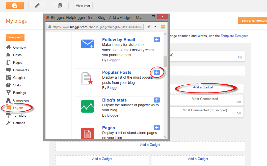
Step 1. First, let's add the Popular posts gadget by going to "Layout" > click on the "Add a gadget" link and select "Popular Posts" from the popup window.

adding popular posts gadget

Step 2. Next, go to "Template" > click on the "Edit HTML" button > click anywhere inside the code area to open the Blogger search box using the CTRL + F keys.

edit blogger template html

Step 3. Type or paste the following tag inside the search box then hit Enter to find it:
</head>
After you found the </head> tag, add this CSS above it:
<style type='text/css'>
.PopularPosts .item-thumbnail a {
clip: auto;
display: block;
height: 130px;
margin: 0 0px 5px;
overflow: hidden;
width: 210px;
border: 2px solid #EEEEEE;
border-radius: 20px;
}
.PopularPosts .item-thumbnail img {
position: relative;
top: -30px;
transition:all .2s linear;
 -o-transition:all .5s linear;
-moz-transition:all .2s linear;
-webkit-transition:all .2s linear;
}
.PopularPosts .item-thumbnail img:hover{
opacity:.6;
filter:alpha(opacity=60)
}
.PopularPosts .widget-content ul li {
background: #F9F9F9;
border: 2px solid #EEEEEE;
border-radius: 10px;
box-shadow: 0 4px 10px #EEEEEE;
color: #555555;
padding: 10px;
margin-bottom: 5px;
}
.PopularPosts .item-title {
clear: both
font: 14px Cambria,Georgia, sans-serif;
color: #2288BB;
font-weight: bold;
text-transform: uppercase;
text-align: center;
}
.PopularPosts .item-snippet {
display: none;
}
.widget .widget-item-control a img {
height: 18px;
width: 18px;
}
</style>
Step 4. Now search for this tag:
</body>
And just above it, add this script:
<script type='text/javascript'>                  
function changeThumbSize(id,size){
var blogGadget = document.getElementById(id);
var replacement = blogGadget.innerHTML;
blogGadget.innerHTML = replacement.replace(/w72-h72-p-k-no-nu/g,"s"+size+"-c");
var thumbnails = blogGadget.getElementsByTagName("img");
for(var i=0;i&lt;thumbnails.length;i++){
thumbnails[i].width = size;
thumbnails[i].height = size;
}
}
changeThumbSize("PopularPosts1",210);                  
</script>
Highlighted in red is the widget ID for the Popular Posts gadget. To change the thumbnail size for any of your blog widgets, find the gadget/widget ID and then add a line below this part:
changeThumbSize("PopularPosts1",210);
changeThumbSize("widget-ID-HERE",210);
Then replace widget-ID-HERE text with the ID of that widget/gadget.

Note: you won't see the changes if the widget has a class selector - for this you may need to change class with id and replace the dot ".>" symbol with "#" in the CSS code.

If you don't know how to find the id of a particular widget, please check out this tutorial on How to Use Firebug to Design a Blogger blog.

Step 5. Finally, press the "Save Template" to save the changes and this is how you can increase thumbnail resolution on Blogger. Enjoy!

Create a CSS3 Image Hover Effect with Animated Vinyl Record

Here is an amazing CSS image effect to reveal more information on your images with a really cool CSS3 hover animation. This is just perfect for blogs dedicated to music or if you just want to show off the music that you love.

So, what we will do in this tutorial is to take an image for our album cover, add some fancy CSS3 transitions and transforms that, on hover, will slide out a pure CSS vinyl record behind it. Finally, we will add some basic HTML to our post or page where we need to apply this amazing effect.

Demo: hover over the album cover and see how CSS reveals further information:

The Wall is the eleventh studio album by the English progressive rock group Pink Floyd.

How to Apply The Animated Vinyl Record on Blogger Images

Step 1. From your Blogger's Dashboard, go to "Template" > click on the "Edit HTML" button:


Step 2. Click anywhere inside the code area and press the CTRL + F keys to open the search box:
Step 3. Type or paste inside the search box the tag below and hit Enter to find it:
]]></b:skin>
Step 4. Just above ]]></b:skin> add the following code:


.info {
position: absolute;
z-index: 3;
top: 20%;
zoom: 1;
filter: alpha(opacity=0);
opacity: 0;
padding: 10px;
text-align: center;
color: #eee;
font-size: 13px;
font-weight: bold;
background: #333;
background: rgba(0,0,0,.7);
-moz-transition:all linear 0.5s 0s;
-webkit-transition:all linear 0.5s 0s;
transition:all ease 0.5s 0s;
}
.case:hover .info, .case:hover .vinyl {
filter: alpha(opacity=100);
opacity:1;
}
.case {
position:relative;
display:block;
width:185px;
height:185px;
-webkit-border-radius:3px;
border-radius:3px;
z-index:2;
-webkit-box-shadow: 0px 0px 2px 0px rgba(0, 0, 0, 0.2);
box-shadow: 0px 0px 2px 0px rgba(0, 0, 0, 0.2);
margin:0 auto;
}
.case:after {
position:absolute;
display:block;
content: "";
width:265px;
height:10px;
left:-40px;
bottom:-8px;
z-index:1;
background: -moz-radial-gradient(center, ellipse cover,  rgba(0,0,0,0.45) 0%, rgba(0,0,0,0) 50%, rgba(225,225,225,0) 51%, rgba(246,246,246,0) 100%);
    background: -webkit-gradient(radial, center center, 0px, center center, 100%, color-stop(0%,rgba(0,0,0,0.45)), color-stop(50%,rgba(0,0,0,0)), color-stop(51%,rgba(225,225,225,0)), color-stop(100%,rgba(246,246,246,0)));
    background: -webkit-radial-gradient(center, ellipse cover,  rgba(0,0,0,0.45) 0%,rgba(0,0,0,0) 50%,rgba(225,225,225,0) 51%,rgba(246,246,246,0) 100%);
    background: -o-radial-gradient(center, ellipse cover,  rgba(0,0,0,0.45) 0%,rgba(0,0,0,0) 50%,rgba(225,225,225,0) 51%,rgba(246,246,246,0) 100%);
    background: -ms-radial-gradient(center, ellipse cover,  rgba(0,0,0,0.45) 0%,rgba(0,0,0,0) 50%,rgba(225,225,225,0) 51%,rgba(246,246,246,0) 100%);
    background: radial-gradient(center, ellipse cover,  rgba(0,0,0,0.45) 0%,rgba(0,0,0,0) 50%,rgba(225,225,225,0) 51%,rgba(246,246,246,0) 100%);
}
.case .cover{
position:absolute;
top:0;
left:0;
width:100%;
height:100%;
z-index:2;
-webkit-border-radius:3px;
border-radius:3px;
-webkit-box-shadow: 2px 0px 2px 0px rgba(0, 0, 0, 0.6);
box-shadow: 2px 0px 2px 0px rgba(0, 0, 0, 0.6);
}
.case .overlay{
position:absolute;
display:block;
top:0;
left:0;
z-index:3;
width:100%;
height:100%;
-webkit-box-shadow: inset 1px 1px 4px 0px rgba(255, 255, 255, 0.45),inset 1px 1px 2px 0px rgba(255,255, 255, 0.5),inset -1px -1px 2px 0px rgba(255,255, 255, 0.5);
    box-shadow: inset 1px 1px 4px 0px rgba(255,255, 255, 0.45),inset 1px 1px 2px 0px rgba(255,255, 255, 0.5),inset -1px -1px 2px 0px rgba(255,255, 255, 0.5);
-webkit-border-radius:3px;
border-radius:3px;
border:1px solid rgba(0, 0, 0, 0.35);
}
.case .overlay:before{
    position:absolute;
    display:block;
    content: "";
    top:0;
    left:0;
    z-index:4;
    width:100%;
    height:100%;
    background: -moz-linear-gradient(-55deg,  rgba(255,255,255,0.1) 0%, rgba(244,244,244,0.35) 50%, rgba(225,225,225,0) 51%, rgba(246,246,246,0) 100%); /* FF3.6+ */
    background: -webkit-gradient(linear, left top, right bottom, color-stop(0%,rgba(255,255,255,0.1)), color-stop(50%,rgba(244,244,244,0.35)), color-stop(51%,rgba(225,225,225,0)), color-stop(100%,rgba(246,246,246,0))); /* Chrome,Safari4+ */
    background: -webkit-linear-gradient(-45deg,  rgba(255,255,255,0.1) 0%,rgba(244,244,244,0.35) 50%,rgba(225,225,225,0) 51%,rgba(246,246,246,0) 100%); /* Chrome10+,Safari5.1+ */
    background: -o-linear-gradient(-45deg,  rgba(255,255,255,0.1) 0%,rgba(244,244,244,0.35) 50%,rgba(225,225,225,0) 51%,rgba(246,246,246,0) 100%); /* Opera 11.10+ */
    background: -ms-linear-gradient(-45deg,  rgba(255,255,255,0.1) 0%,rgba(244,244,244,0.35) 50%,rgba(225,225,225,0) 51%,rgba(246,246,246,0) 100%); /* IE10+ */
    background: linear-gradient(-55deg,  rgba(255,255,255,0.1) 0%,rgba(244,244,244,0.35) 50%,rgba(225,225,225,0) 51%,rgba(246,246,246,0) 100%); /* W3C */
    -webkit-border-radius:3px;
    border-radius:3px;
}
.vinyl {
    position:absolute;
    z-index:1;
    bottom:4px;
    left:5px;
    display:block;
    width:175px;
    height:175px;
    border-radius:200px;
    background: -moz-linear-gradient(top,  rgba(45,45,45,1) 0%, rgba(0,0,0,1) 100%);
    background: -webkit-gradient(linear, left top, left bottom, color-stop(0%,rgba(45,45,45,1)), color-stop(100%,rgba(0,0,0,1)));
    background: -webkit-linear-gradient(top,  rgba(45,45,45,1) 0%,rgba(0,0,0,1) 100%);
    background: -o-linear-gradient(top,  rgba(45,45,45,1) 0%,rgba(0,0,0,1) 100%);
    background: -ms-linear-gradient(top,  rgba(45,45,45,1) 0%,rgba(0,0,0,1) 100%);
    background: linear-gradient(top,  rgba(45,45,45,1) 0%,rgba(0,0,0,1) 100%);
    -webkit-box-shadow: inset 0px 1px 3px 0px rgba(255, 255, 255, 1);
    box-shadow: inset 0px 1px 0px 0px rgba(255, 255, 255, 0.35), inset 0px -1px 1px 0px rgba(255, 255, 255, 0.25), 0px 0px 8px 0px rgba(0, 0, 0, 0.4);
    border:1px solid #595959;
    transition: all 500ms ease-in-out;
    -moz-transition: all 500ms ease-in-out;
    -webkit-transition: all 500ms ease-in-out;
    -o-transition: all 500ms ease-in-out;
}
.case:hover .vinyl {
    animation: spin 600ms ease-in-out;
    -moz-animation: spin 600ms ease-in-out;
    -webkit-animation: spin 600ms ease-in-out;
    left:98px;
}
.vinyl:before {
    position:absolute;
    display:block;
    content: "";
    width:100%;
    height:100%;
    border-radius:100%;
    background: -moz-radial-gradient(center, ellipse cover,  rgba(38,38,38,0.4) 0%, rgba(89,89,89,0.4) 1%, rgba(35,35,35,0.4) 2%, rgba(86,86,86,0.4) 3%, rgba(35,35,35,0.4) 4%, rgba(86,86,86,0.4) 5%, rgba(35,35,35,0.4) 6%, rgba(86,86,86,0.4) 7%, rgba(35,35,35,0.4) 8%, rgba(86,86,86,0.4) 9%, rgba(35,35,35,0.4) 10%, rgba(86,86,86,0.4) 11%, rgba(35,35,35,0.4) 12%, rgba(86,86,86,0.4) 13%, rgba(35,35,35,0.4) 14%, rgba(86,86,86,0.4) 15%, rgba(35,35,35,0.4) 16%, rgba(86,86,86,0.4) 17%, rgba(35,35,35,0.4) 18%, rgba(86,86,86,0.4) 19%, rgba(35,35,35,0.4) 20%, rgba(86,86,86,0.4) 21%, rgba(35,35,35,0.4) 22%, rgba(86,86,86,0.4) 23%, rgba(35,35,35,0.4) 24%, rgba(86,86,86,0.4) 25%, rgba(35,35,35,0.4) 26%, rgba(86,86,86,0.4) 27%, rgba(35,35,35,0.4) 28%, rgba(86,86,86,0.4) 29%, rgba(35,35,35,0.4) 30%, rgba(86,86,86,0.4) 31%, rgba(35,35,35,0.4) 32%, rgba(86,86,86,0.4) 33%, rgba(35,35,35,0.4) 34%, rgba(86,86,86,0.4) 35%, rgba(35,35,35,0.4) 36%, rgba(86,86,86,0.4) 37%, rgba(35,35,35,0.4) 38%, rgba(86,86,86,0.4) 39%, rgba(35,35,35,0.4) 40%, rgba(86,86,86,0.4) 41%, rgba(35,35,35,0.4) 42%, rgba(86,86,86,0.4) 43%, rgba(35,35,35,0.4) 44%, rgba(86,86,86,0.4) 45%, rgba(35,35,35,0.4) 46%, rgba(86,86,86,0.4) 47%, rgba(35,35,35,0.4) 48%, rgba(86,86,86,0.4) 49%, rgba(35,35,35,0.4) 50%, rgba(86,86,86,0.4) 51%, rgba(35,35,35,0.4) 52%, rgba(86,86,86,0.4) 53%, rgba(35,35,35,0.4) 54%, rgba(86,86,86,0.4) 55%, rgba(35,35,35,0.4) 56%, rgba(86,86,86,0.4) 57%, rgba(35,35,35,0.4) 58%, rgba(86,86,86,0.4) 59%, rgba(35,35,35,0.4) 60%, rgba(86,86,86,0.4) 61%, rgba(35,35,35,0.4) 62%, rgba(86,86,86,0.4) 63%, rgba(35,35,35,0.4) 64%, rgba(86,86,86,0.4) 65%, rgba(35,35,35,0.4) 66%, rgba(86,86,86,0.4) 67%, rgba(35,35,35,0.4) 68%, rgba(86,86,86,0.4) 69%, rgba(35,35,35,0.4) 70%, rgba(86,86,86,0.4) 71%, rgba(35,35,35,0.4) 72%, rgba(86,86,86,0.4) 73%, rgba(35,35,35,0.4) 74%, rgba(86,86,86,0.4) 75%, rgba(35,35,35,0.4) 76%, rgba(86,86,86,0.4) 77%, rgba(35,35,35,0.4) 78%, rgba(86,86,86,0.4) 79%, rgba(35,35,35,0.4) 80%, rgba(86,86,86,0.4) 81%, rgba(35,35,35,0.4) 82%, rgba(86,86,86,0.4) 83%, rgba(35,35,35,0.4) 84%, rgba(86,86,86,0.4) 85%, rgba(35,35,35,0.4) 86%, rgba(86,86,86,0.4) 87%, rgba(35,35,35,0.4) 88%, rgba(86,86,86,0.4) 89%, rgba(35,35,35,0.4) 90%, rgba(86,86,86,0.4) 91%, rgba(35,35,35,0.4) 92%, rgba(86,86,86,0.4) 93%, rgba(35,35,35,0.4) 94%, rgba(86,86,86,0.4) 95%, rgba(35,35,35,0.4) 96%, rgba(86,86,86,0.4) 97%, rgba(86,86,86,0.4) 97%, rgba(35,35,35,0.4) 98%);
    background: -webkit-gradient(radial, center center, 0px, center center, 100%, color-stop(0%,rgba(38,38,38,0.4)), color-stop(1%,rgba(89,89,89,0.4)), color-stop(2%,rgba(35,35,35,0.4)), color-stop(3%,rgba(86,86,86,0.4)), color-stop(4%,rgba(35,35,35,0.4)), color-stop(5%,rgba(86,86,86,0.4)), color-stop(6%,rgba(35,35,35,0.4)), color-stop(7%,rgba(86,86,86,0.4)), color-stop(8%,rgba(35,35,35,0.4)), color-stop(9%,rgba(86,86,86,0.4)), color-stop(10%,rgba(35,35,35,0.4)), color-stop(11%,rgba(86,86,86,0.4)), color-stop(12%,rgba(35,35,35,0.4)), color-stop(13%,rgba(86,86,86,0.4)), color-stop(14%,rgba(35,35,35,0.4)), color-stop(15%,rgba(86,86,86,0.4)), color-stop(16%,rgba(35,35,35,0.4)), color-stop(17%,rgba(86,86,86,0.4)), color-stop(18%,rgba(35,35,35,0.4)), color-stop(19%,rgba(86,86,86,0.4)), color-stop(20%,rgba(35,35,35,0.4)), color-stop(21%,rgba(86,86,86,0.4)), color-stop(22%,rgba(35,35,35,0.4)), color-stop(23%,rgba(86,86,86,0.4)), color-stop(24%,rgba(35,35,35,0.4)), color-stop(25%,rgba(86,86,86,0.4)), color-stop(26%,rgba(35,35,35,0.4)), color-stop(27%,rgba(86,86,86,0.4)), color-stop(28%,rgba(35,35,35,0.4)), color-stop(29%,rgba(86,86,86,0.4)), color-stop(30%,rgba(35,35,35,0.4)), color-stop(31%,rgba(86,86,86,0.4)), color-stop(32%,rgba(35,35,35,0.4)), color-stop(33%,rgba(86,86,86,0.4)), color-stop(34%,rgba(35,35,35,0.4)), color-stop(35%,rgba(86,86,86,0.4)), color-stop(36%,rgba(35,35,35,0.4)), color-stop(37%,rgba(86,86,86,0.4)), color-stop(38%,rgba(35,35,35,0.4)), color-stop(39%,rgba(86,86,86,0.4)), color-stop(40%,rgba(35,35,35,0.4)), color-stop(41%,rgba(86,86,86,0.4)), color-stop(42%,rgba(35,35,35,0.4)), color-stop(43%,rgba(86,86,86,0.4)), color-stop(44%,rgba(35,35,35,0.4)), color-stop(45%,rgba(86,86,86,0.4)), color-stop(46%,rgba(35,35,35,0.4)), color-stop(47%,rgba(86,86,86,0.4)), color-stop(48%,rgba(35,35,35,0.4)), color-stop(49%,rgba(86,86,86,0.4)), color-stop(50%,rgba(35,35,35,0.4)), color-stop(51%,rgba(86,86,86,0.4)), color-stop(52%,rgba(35,35,35,0.4)), color-stop(53%,rgba(86,86,86,0.4)), color-stop(54%,rgba(35,35,35,0.4)), color-stop(55%,rgba(86,86,86,0.4)), color-stop(56%,rgba(35,35,35,0.4)), color-stop(57%,rgba(86,86,86,0.4)), color-stop(58%,rgba(35,35,35,0.4)), color-stop(59%,rgba(86,86,86,0.4)), color-stop(60%,rgba(35,35,35,0.4)), color-stop(61%,rgba(86,86,86,0.4)), color-stop(62%,rgba(35,35,35,0.4)), color-stop(63%,rgba(86,86,86,0.4)), color-stop(64%,rgba(35,35,35,0.4)), color-stop(65%,rgba(86,86,86,0.4)), color-stop(66%,rgba(35,35,35,0.4)), color-stop(67%,rgba(86,86,86,0.4)), color-stop(68%,rgba(35,35,35,0.4)), color-stop(69%,rgba(86,86,86,0.4)), color-stop(70%,rgba(35,35,35,0.4)), color-stop(71%,rgba(86,86,86,0.4)), color-stop(72%,rgba(35,35,35,0.4)), color-stop(73%,rgba(86,86,86,0.4)), color-stop(74%,rgba(35,35,35,0.4)), color-stop(75%,rgba(86,86,86,0.4)), color-stop(76%,rgba(35,35,35,0.4)), color-stop(77%,rgba(86,86,86,0.4)), color-stop(78%,rgba(35,35,35,0.4)), color-stop(79%,rgba(86,86,86,0.4)), color-stop(80%,rgba(35,35,35,0.4)), color-stop(81%,rgba(86,86,86,0.4)), color-stop(82%,rgba(35,35,35,0.4)), color-stop(83%,rgba(86,86,86,0.4)), color-stop(84%,rgba(35,35,35,0.4)), color-stop(85%,rgba(86,86,86,0.4)), color-stop(86%,rgba(35,35,35,0.4)), color-stop(87%,rgba(86,86,86,0.4)), color-stop(88%,rgba(35,35,35,0.4)), color-stop(89%,rgba(86,86,86,0.4)), color-stop(90%,rgba(35,35,35,0.4)), color-stop(91%,rgba(86,86,86,0.4)), color-stop(92%,rgba(35,35,35,0.4)), color-stop(93%,rgba(86,86,86,0.4)), color-stop(94%,rgba(35,35,35,0.4)), color-stop(95%,rgba(86,86,86,0.4)), color-stop(96%,rgba(35,35,35,0.4)), color-stop(97%,rgba(86,86,86,0.4)), color-stop(97%,rgba(86,86,86,0.4)), color-stop(98%,rgba(35,35,35,0.4)));
    background: -webkit-radial-gradient(center, ellipse cover,  rgba(38,38,38,0.4) 0%,rgba(89,89,89,0.4) 1%,rgba(35,35,35,0.4) 2%,rgba(86,86,86,0.4) 3%,rgba(35,35,35,0.4) 4%,rgba(86,86,86,0.4) 5%,rgba(35,35,35,0.4) 6%,rgba(86,86,86,0.4) 7%,rgba(35,35,35,0.4) 8%,rgba(86,86,86,0.4) 9%,rgba(35,35,35,0.4) 10%,rgba(86,86,86,0.4) 11%,rgba(35,35,35,0.4) 12%,rgba(86,86,86,0.4) 13%,rgba(35,35,35,0.4) 14%,rgba(86,86,86,0.4) 15%,rgba(35,35,35,0.4) 16%,rgba(86,86,86,0.4) 17%,rgba(35,35,35,0.4) 18%,rgba(86,86,86,0.4) 19%,rgba(35,35,35,0.4) 20%,rgba(86,86,86,0.4) 21%,rgba(35,35,35,0.4) 22%,rgba(86,86,86,0.4) 23%,rgba(35,35,35,0.4) 24%,rgba(86,86,86,0.4) 25%,rgba(35,35,35,0.4) 26%,rgba(86,86,86,0.4) 27%,rgba(35,35,35,0.4) 28%,rgba(86,86,86,0.4) 29%,rgba(35,35,35,0.4) 30%,rgba(86,86,86,0.4) 31%,rgba(35,35,35,0.4) 32%,rgba(86,86,86,0.4) 33%,rgba(35,35,35,0.4) 34%,rgba(86,86,86,0.4) 35%,rgba(35,35,35,0.4) 36%,rgba(86,86,86,0.4) 37%,rgba(35,35,35,0.4) 38%,rgba(86,86,86,0.4) 39%,rgba(35,35,35,0.4) 40%,rgba(86,86,86,0.4) 41%,rgba(35,35,35,0.4) 42%,rgba(86,86,86,0.4) 43%,rgba(35,35,35,0.4) 44%,rgba(86,86,86,0.4) 45%,rgba(35,35,35,0.4) 46%,rgba(86,86,86,0.4) 47%,rgba(35,35,35,0.4) 48%,rgba(86,86,86,0.4) 49%,rgba(35,35,35,0.4) 50%,rgba(86,86,86,0.4) 51%,rgba(35,35,35,0.4) 52%,rgba(86,86,86,0.4) 53%,rgba(35,35,35,0.4) 54%,rgba(86,86,86,0.4) 55%,rgba(35,35,35,0.4) 56%,rgba(86,86,86,0.4) 57%,rgba(35,35,35,0.4) 58%,rgba(86,86,86,0.4) 59%,rgba(35,35,35,0.4) 60%,rgba(86,86,86,0.4) 61%,rgba(35,35,35,0.4) 62%,rgba(86,86,86,0.4) 63%,rgba(35,35,35,0.4) 64%,rgba(86,86,86,0.4) 65%,rgba(35,35,35,0.4) 66%,rgba(86,86,86,0.4) 67%,rgba(35,35,35,0.4) 68%,rgba(86,86,86,0.4) 69%,rgba(35,35,35,0.4) 70%,rgba(86,86,86,0.4) 71%,rgba(35,35,35,0.4) 72%,rgba(86,86,86,0.4) 73%,rgba(35,35,35,0.4) 74%,rgba(86,86,86,0.4) 75%,rgba(35,35,35,0.4) 76%,rgba(86,86,86,0.4) 77%,rgba(35,35,35,0.4) 78%,rgba(86,86,86,0.4) 79%,rgba(35,35,35,0.4) 80%,rgba(86,86,86,0.4) 81%,rgba(35,35,35,0.4) 82%,rgba(86,86,86,0.4) 83%,rgba(35,35,35,0.4) 84%,rgba(86,86,86,0.4) 85%,rgba(35,35,35,0.4) 86%,rgba(86,86,86,0.4) 87%,rgba(35,35,35,0.4) 88%,rgba(86,86,86,0.4) 89%,rgba(35,35,35,0.4) 90%,rgba(86,86,86,0.4) 91%,rgba(35,35,35,0.4) 92%,rgba(86,86,86,0.4) 93%,rgba(35,35,35,0.4) 94%,rgba(86,86,86,0.4) 95%,rgba(35,35,35,0.4) 96%,rgba(86,86,86,0.4) 97%,rgba(86,86,86,0.4) 97%,rgba(35,35,35,0.4) 98%);
    background: -o-radial-gradient(center, ellipse cover,  rgba(38,38,38,0.4) 0%,rgba(89,89,89,0.4) 1%,rgba(35,35,35,0.4) 2%,rgba(86,86,86,0.4) 3%,rgba(35,35,35,0.4) 4%,rgba(86,86,86,0.4) 5%,rgba(35,35,35,0.4) 6%,rgba(86,86,86,0.4) 7%,rgba(35,35,35,0.4) 8%,rgba(86,86,86,0.4) 9%,rgba(35,35,35,0.4) 10%,rgba(86,86,86,0.4) 11%,rgba(35,35,35,0.4) 12%,rgba(86,86,86,0.4) 13%,rgba(35,35,35,0.4) 14%,rgba(86,86,86,0.4) 15%,rgba(35,35,35,0.4) 16%,rgba(86,86,86,0.4) 17%,rgba(35,35,35,0.4) 18%,rgba(86,86,86,0.4) 19%,rgba(35,35,35,0.4) 20%,rgba(86,86,86,0.4) 21%,rgba(35,35,35,0.4) 22%,rgba(86,86,86,0.4) 23%,rgba(35,35,35,0.4) 24%,rgba(86,86,86,0.4) 25%,rgba(35,35,35,0.4) 26%,rgba(86,86,86,0.4) 27%,rgba(35,35,35,0.4) 28%,rgba(86,86,86,0.4) 29%,rgba(35,35,35,0.4) 30%,rgba(86,86,86,0.4) 31%,rgba(35,35,35,0.4) 32%,rgba(86,86,86,0.4) 33%,rgba(35,35,35,0.4) 34%,rgba(86,86,86,0.4) 35%,rgba(35,35,35,0.4) 36%,rgba(86,86,86,0.4) 37%,rgba(35,35,35,0.4) 38%,rgba(86,86,86,0.4) 39%,rgba(35,35,35,0.4) 40%,rgba(86,86,86,0.4) 41%,rgba(35,35,35,0.4) 42%,rgba(86,86,86,0.4) 43%,rgba(35,35,35,0.4) 44%,rgba(86,86,86,0.4) 45%,rgba(35,35,35,0.4) 46%,rgba(86,86,86,0.4) 47%,rgba(35,35,35,0.4) 48%,rgba(86,86,86,0.4) 49%,rgba(35,35,35,0.4) 50%,rgba(86,86,86,0.4) 51%,rgba(35,35,35,0.4) 52%,rgba(86,86,86,0.4) 53%,rgba(35,35,35,0.4) 54%,rgba(86,86,86,0.4) 55%,rgba(35,35,35,0.4) 56%,rgba(86,86,86,0.4) 57%,rgba(35,35,35,0.4) 58%,rgba(86,86,86,0.4) 59%,rgba(35,35,35,0.4) 60%,rgba(86,86,86,0.4) 61%,rgba(35,35,35,0.4) 62%,rgba(86,86,86,0.4) 63%,rgba(35,35,35,0.4) 64%,rgba(86,86,86,0.4) 65%,rgba(35,35,35,0.4) 66%,rgba(86,86,86,0.4) 67%,rgba(35,35,35,0.4) 68%,rgba(86,86,86,0.4) 69%,rgba(35,35,35,0.4) 70%,rgba(86,86,86,0.4) 71%,rgba(35,35,35,0.4) 72%,rgba(86,86,86,0.4) 73%,rgba(35,35,35,0.4) 74%,rgba(86,86,86,0.4) 75%,rgba(35,35,35,0.4) 76%,rgba(86,86,86,0.4) 77%,rgba(35,35,35,0.4) 78%,rgba(86,86,86,0.4) 79%,rgba(35,35,35,0.4) 80%,rgba(86,86,86,0.4) 81%,rgba(35,35,35,0.4) 82%,rgba(86,86,86,0.4) 83%,rgba(35,35,35,0.4) 84%,rgba(86,86,86,0.4) 85%,rgba(35,35,35,0.4) 86%,rgba(86,86,86,0.4) 87%,rgba(35,35,35,0.4) 88%,rgba(86,86,86,0.4) 89%,rgba(35,35,35,0.4) 90%,rgba(86,86,86,0.4) 91%,rgba(35,35,35,0.4) 92%,rgba(86,86,86,0.4) 93%,rgba(35,35,35,0.4) 94%,rgba(86,86,86,0.4) 95%,rgba(35,35,35,0.4) 96%,rgba(86,86,86,0.4) 97%,rgba(86,86,86,0.4) 97%,rgba(35,35,35,0.4) 98%);
    background: -ms-radial-gradient(center, ellipse cover,  rgba(38,38,38,0.4) 0%,rgba(89,89,89,0.4) 1%,rgba(35,35,35,0.4) 2%,rgba(86,86,86,0.4) 3%,rgba(35,35,35,0.4) 4%,rgba(86,86,86,0.4) 5%,rgba(35,35,35,0.4) 6%,rgba(86,86,86,0.4) 7%,rgba(35,35,35,0.4) 8%,rgba(86,86,86,0.4) 9%,rgba(35,35,35,0.4) 10%,rgba(86,86,86,0.4) 11%,rgba(35,35,35,0.4) 12%,rgba(86,86,86,0.4) 13%,rgba(35,35,35,0.4) 14%,rgba(86,86,86,0.4) 15%,rgba(35,35,35,0.4) 16%,rgba(86,86,86,0.4) 17%,rgba(35,35,35,0.4) 18%,rgba(86,86,86,0.4) 19%,rgba(35,35,35,0.4) 20%,rgba(86,86,86,0.4) 21%,rgba(35,35,35,0.4) 22%,rgba(86,86,86,0.4) 23%,rgba(35,35,35,0.4) 24%,rgba(86,86,86,0.4) 25%,rgba(35,35,35,0.4) 26%,rgba(86,86,86,0.4) 27%,rgba(35,35,35,0.4) 28%,rgba(86,86,86,0.4) 29%,rgba(35,35,35,0.4) 30%,rgba(86,86,86,0.4) 31%,rgba(35,35,35,0.4) 32%,rgba(86,86,86,0.4) 33%,rgba(35,35,35,0.4) 34%,rgba(86,86,86,0.4) 35%,rgba(35,35,35,0.4) 36%,rgba(86,86,86,0.4) 37%,rgba(35,35,35,0.4) 38%,rgba(86,86,86,0.4) 39%,rgba(35,35,35,0.4) 40%,rgba(86,86,86,0.4) 41%,rgba(35,35,35,0.4) 42%,rgba(86,86,86,0.4) 43%,rgba(35,35,35,0.4) 44%,rgba(86,86,86,0.4) 45%,rgba(35,35,35,0.4) 46%,rgba(86,86,86,0.4) 47%,rgba(35,35,35,0.4) 48%,rgba(86,86,86,0.4) 49%,rgba(35,35,35,0.4) 50%,rgba(86,86,86,0.4) 51%,rgba(35,35,35,0.4) 52%,rgba(86,86,86,0.4) 53%,rgba(35,35,35,0.4) 54%,rgba(86,86,86,0.4) 55%,rgba(35,35,35,0.4) 56%,rgba(86,86,86,0.4) 57%,rgba(35,35,35,0.4) 58%,rgba(86,86,86,0.4) 59%,rgba(35,35,35,0.4) 60%,rgba(86,86,86,0.4) 61%,rgba(35,35,35,0.4) 62%,rgba(86,86,86,0.4) 63%,rgba(35,35,35,0.4) 64%,rgba(86,86,86,0.4) 65%,rgba(35,35,35,0.4) 66%,rgba(86,86,86,0.4) 67%,rgba(35,35,35,0.4) 68%,rgba(86,86,86,0.4) 69%,rgba(35,35,35,0.4) 70%,rgba(86,86,86,0.4) 71%,rgba(35,35,35,0.4) 72%,rgba(86,86,86,0.4) 73%,rgba(35,35,35,0.4) 74%,rgba(86,86,86,0.4) 75%,rgba(35,35,35,0.4) 76%,rgba(86,86,86,0.4) 77%,rgba(35,35,35,0.4) 78%,rgba(86,86,86,0.4) 79%,rgba(35,35,35,0.4) 80%,rgba(86,86,86,0.4) 81%,rgba(35,35,35,0.4) 82%,rgba(86,86,86,0.4) 83%,rgba(35,35,35,0.4) 84%,rgba(86,86,86,0.4) 85%,rgba(35,35,35,0.4) 86%,rgba(86,86,86,0.4) 87%,rgba(35,35,35,0.4) 88%,rgba(86,86,86,0.4) 89%,rgba(35,35,35,0.4) 90%,rgba(86,86,86,0.4) 91%,rgba(35,35,35,0.4) 92%,rgba(86,86,86,0.4) 93%,rgba(35,35,35,0.4) 94%,rgba(86,86,86,0.4) 95%,rgba(35,35,35,0.4) 96%,rgba(86,86,86,0.4) 97%,rgba(86,86,86,0.4) 97%,rgba(35,35,35,0.4) 98%);
    background: radial-gradient(center, ellipse cover,  rgba(38,38,38,0.4) 0%,rgba(89,89,89,0.4) 1%,rgba(35,35,35,0.4) 2%,rgba(86,86,86,0.4) 3%,rgba(35,35,35,0.4) 4%,rgba(86,86,86,0.4) 5%,rgba(35,35,35,0.4) 6%,rgba(86,86,86,0.4) 7%,rgba(35,35,35,0.4) 8%,rgba(86,86,86,0.4) 9%,rgba(35,35,35,0.4) 10%,rgba(86,86,86,0.4) 11%,rgba(35,35,35,0.4) 12%,rgba(86,86,86,0.4) 13%,rgba(35,35,35,0.4) 14%,rgba(86,86,86,0.4) 15%,rgba(35,35,35,0.4) 16%,rgba(86,86,86,0.4) 17%,rgba(35,35,35,0.4) 18%,rgba(86,86,86,0.4) 19%,rgba(35,35,35,0.4) 20%,rgba(86,86,86,0.4) 21%,rgba(35,35,35,0.4) 22%,rgba(86,86,86,0.4) 23%,rgba(35,35,35,0.4) 24%,rgba(86,86,86,0.4) 25%,rgba(35,35,35,0.4) 26%,rgba(86,86,86,0.4) 27%,rgba(35,35,35,0.4) 28%,rgba(86,86,86,0.4) 29%,rgba(35,35,35,0.4) 30%,rgba(86,86,86,0.4) 31%,rgba(35,35,35,0.4) 32%,rgba(86,86,86,0.4) 33%,rgba(35,35,35,0.4) 34%,rgba(86,86,86,0.4) 35%,rgba(35,35,35,0.4) 36%,rgba(86,86,86,0.4) 37%,rgba(35,35,35,0.4) 38%,rgba(86,86,86,0.4) 39%,rgba(35,35,35,0.4) 40%,rgba(86,86,86,0.4) 41%,rgba(35,35,35,0.4) 42%,rgba(86,86,86,0.4) 43%,rgba(35,35,35,0.4) 44%,rgba(86,86,86,0.4) 45%,rgba(35,35,35,0.4) 46%,rgba(86,86,86,0.4) 47%,rgba(35,35,35,0.4) 48%,rgba(86,86,86,0.4) 49%,rgba(35,35,35,0.4) 50%,rgba(86,86,86,0.4) 51%,rgba(35,35,35,0.4) 52%,rgba(86,86,86,0.4) 53%,rgba(35,35,35,0.4) 54%,rgba(86,86,86,0.4) 55%,rgba(35,35,35,0.4) 56%,rgba(86,86,86,0.4) 57%,rgba(35,35,35,0.4) 58%,rgba(86,86,86,0.4) 59%,rgba(35,35,35,0.4) 60%,rgba(86,86,86,0.4) 61%,rgba(35,35,35,0.4) 62%,rgba(86,86,86,0.4) 63%,rgba(35,35,35,0.4) 64%,rgba(86,86,86,0.4) 65%,rgba(35,35,35,0.4) 66%,rgba(86,86,86,0.4) 67%,rgba(35,35,35,0.4) 68%,rgba(86,86,86,0.4) 69%,rgba(35,35,35,0.4) 70%,rgba(86,86,86,0.4) 71%,rgba(35,35,35,0.4) 72%,rgba(86,86,86,0.4) 73%,rgba(35,35,35,0.4) 74%,rgba(86,86,86,0.4) 75%,rgba(35,35,35,0.4) 76%,rgba(86,86,86,0.4) 77%,rgba(35,35,35,0.4) 78%,rgba(86,86,86,0.4) 79%,rgba(35,35,35,0.4) 80%,rgba(86,86,86,0.4) 81%,rgba(35,35,35,0.4) 82%,rgba(86,86,86,0.4) 83%,rgba(35,35,35,0.4) 84%,rgba(86,86,86,0.4) 85%,rgba(35,35,35,0.4) 86%,rgba(86,86,86,0.4) 87%,rgba(35,35,35,0.4) 88%,rgba(86,86,86,0.4) 89%,rgba(35,35,35,0.4) 90%,rgba(86,86,86,0.4) 91%,rgba(35,35,35,0.4) 92%,rgba(86,86,86,0.4) 93%,rgba(35,35,35,0.4) 94%,rgba(86,86,86,0.4) 95%,rgba(35,35,35,0.4) 96%,rgba(86,86,86,0.4) 97%,rgba(86,86,86,0.4) 97%,rgba(35,35,35,0.4) 98%);
    top:0;
    left:0;
}
.vinyl:after {
    position:absolute;
    display:block;
    content: "\002022";
    width:34px;
    height:53px;
    line-height:53px;
    border-radius:53px;
    top:60px;
    left:60px;
    padding-left:19px;
    color:#000;
    background: -moz-linear-gradient(-45deg,  rgba(252,252,252,1) 0%, rgba(239,239,239,1) 100%);
    background: -webkit-gradient(linear, left top, right bottom, color-stop(0%,rgba(252,252,252,1)), color-stop(100%,rgba(239,239,239,1)));
    background: -webkit-linear-gradient(-45deg,  rgba(252,252,252,1) 0%,rgba(239,239,239,1) 100%);
    background: -o-linear-gradient(-45deg,  rgba(252,252,252,1) 0%,rgba(239,239,239,1) 100%);
    background: -ms-linear-gradient(-45deg,  rgba(252,252,252,1) 0%,rgba(239,239,239,1) 100%);
    background: linear-gradient(-45deg,  rgba(252,252,252,1) 0%,rgba(239,239,239,1) 100%);
    border:1px solid #000;
    font-size:40px;
    text-shadow: 0px 0px 3px rgba(0,0,0, 0.8);
}
.slotwrapper {
    position:absolute;
    display:block;
    top:0px;
    right:-10px;
    height:100%;
    width:10px;
    overflow:hidden;
}
.slot{
    position:absolute;
    display:block;
    top:-160px;
    left:-67px;
    height:505px;
    width:85px;
    background: -moz-radial-gradient(center, ellipse cover,  rgba(255,255,255,1) 0%, rgba(255,255,255,1) 50%, rgba(76,76,76,1) 51%, rgba(76,76,76,0) 52%, rgba(0,0,0,0.1) 53%, rgba(0,0,0,0) 58%);
    background: -webkit-gradient(radial, center center, 0px, center center, 100%, color-stop(0%,rgba(255,255,255,1)), color-stop(50%,rgba(255,255,255,1)), color-stop(51%,rgba(76,76,76,1)), color-stop(52%,rgba(76,76,76,0)), color-stop(53%,rgba(0,0,0,0.1)), color-stop(58%,rgba(0,0,0,0)));
    background: -webkit-radial-gradient(center, ellipse cover,  rgba(255,255,255,1) 0%,rgba(255,255,255,1) 50%,rgba(76,76,76,1) 51%,rgba(76,76,76,0) 52%,rgba(0,0,0,0.1) 53%,rgba(0,0,0,0) 58%);
    background: -o-radial-gradient(center, ellipse cover,  rgba(255,255,255,1) 0%,rgba(255,255,255,1) 50%,rgba(76,76,76,1) 51%,rgba(76,76,76,0) 52%,rgba(0,0,0,0.1) 53%,rgba(0,0,0,0) 58%);
    background: -ms-radial-gradient(center, ellipse cover,  rgba(255,255,255,1) 0%,rgba(255,255,255,1) 50%,rgba(76,76,76,1) 51%,rgba(76,76,76,0) 52%,rgba(0,0,0,0.1) 53%,rgba(0,0,0,0) 58%);
    background: radial-gradient(center, ellipse cover,  rgba(255,255,255,1) 0%,rgba(255,255,255,1) 50%,rgba(76,76,76,1) 51%,rgba(76,76,76,0) 52%,rgba(0,0,0,0.1) 53%,rgba(0,0,0,0) 58%);
}
@keyframes spin
{
from {
    -moz-transform:rotate(0deg);
    -webkit-transform:rotate(0deg);
    -o-transform:rotate(0deg);
    -ms-transform:rotate(0deg);
    transform:rotate(0deg);
}
to {
    -moz-transform:rotate(360deg);
    -webkit-transform:rotate(360deg);
    -o-transform:rotate(360deg);
    -ms-transform:rotate(360deg);
    transform:rotate(360deg);
}
}

@-moz-keyframes spin
{
from {
    -moz-transform:rotate(0deg);
    transform:rotate(0deg);
}
to {
    -moz-transform:rotate(360deg);
    transform:rotate(360deg);
}
}

@-webkit-keyframes spin
{
from {
    -webkit-transform:rotate(0deg);
    transform:rotate(0deg);
}
to {
    -webkit-transform:rotate(360deg);
    transform:rotate(360deg);
}

Step 5. Click on the "Save template" button to save the changes.

For applying the animated vinyl record effect on your image, first upload the picture for your album cover, copy the URL of it and then paste it inside a Notepad so that you can use it later. If you don't know how to upload images and get the URLs, please see this tutorial: How to upload images and get the URLs

Step 6. When you create a post, add this code inside the HTML section:
<div class="case">
 <div class="overlay"></div>
 <img class="cover" src="http://add-image-url-here.com/"/>
<span class="info">TEXT HERE</span>
   <div class="slotwrapper">
  <div class="slot"></div>
 </div>
 <div class="vinyl"></div>
</div>
Replace the URL in blue with the one that you saved earlier and the text in red with the info to show on mouse over. In case you don't need any info, remove this part:
<span class="info">TEXT HERE</span>
Step 7. Publish your post and you're done. Enjoy!