Showing posts with label css. Show all posts

CSS Rollover Image Effect - Change Image on Hover

Rollover image is a design feature where an image changes when your mouse hovers over it. Think of a light bulb that turns on and off when you move your mouse cursor into that area of a page. When a page is loading, rollover images are preloaded into it to ensure that the rollover effect is displayed quickly.

This used to be implemented using JavaScript, which is fairly easy with just a small amount of script involved. To make rollover images functional, onmouseover and onmouseout attributes are used to a link tag. The code is then added to a blog gadget or into a new post. It proved to have a number of disadvantages, however, which is why many web developers are using a CSS-only method.

css rollover image

How to create a rollover image using CSS

Here is how to implement a rollover image using CSS. Before getting started, we need to have two images ready, one in its initial/static state as well as its rollover state.

The Image

Place both the static and rollover image in one file and make sure that the rollover image is placed on top of the static one. To achieve the rollover effect, we'll write a code to display the static image and crop the hover image, so that only one image state is displayed at a time.

For this tutorial, we'll use the following as a CSS rollover image.

html rollover image

Creating an HTML Anchor Element for our Image

Instead of adding the image file in a <img> tag, we'll display it as a background image of an </a> (anchor) tag. Here's the HTML that we need to add:
<a class="rolloverimage" href="#URL">Rollover Image</a>
Note: if you want to make the image clickable, replace #URL with the url of the webpage where you want the link to point to.

Using CSS to Set a Background Image

To create the mouseover image effect, we'll use the :hover CSS pseudo-class. Then, we'll use the background-position property and set the values to 0 0 to move the background image to the upper left corner which will create the rollover effect.
<style type="text/css">
.rolloverimage{
display: block;
width: 56px;
height: 90px;
background: url('https://blogger.googleusercontent.com/img/b/R29vZ2xl/AVvXsEghvUi2PqP5_a81N6lMolVGd2FJCTQhi3vlAabIMoIyhq-2k5mZRhQlVobhyxPr0UmDY0MIxx7rQpaRb-NR7YBwkuyQ7XfttTvj4cxUFWnTGn3YQMdOJsaEeN6Qs4HnMpE9ZbMgyrxV-fA1/s180/rollover-image-light-bulb-on-off.png') bottom;
text-indent: -99999px;
}
.rolloverimage:hover{
background-position: 0 0;
}
</style>
Note: Replace the text in blue with the url of your image file. Please pay attention on the width and height values marked in red, these should be different depending on your file, where the height value is for only one image and not the entire image file!

The result

Hover your mouse cursor over the light bulb to see the rollover image effect in action:

Rollover Image

Adding Rollover Image to Blogger

To add the rollover image as a gadget: copy both the HTML/CSS codes and go to 'Layout', click on the 'Add a Gadget' link > select HTML/JavaScript, then paste the codes in the 'Content' box.

Or, if you want to add it inside one of your posts, when you create a New Post, switch to the 'HTML' tab and paste the codes inside the empty box.

And this is how you make images swap on mouseover using CSS. Enjoy!

How To Host Blogger CSS and JavaScript Files in Google Drive

Anyone that has ever worked on a web design or development can tell you that where you decide to store your files is important. Every time someone visits your site, the server or host will access this location and bring up the relevant files that need to be displayed. Wherever you decide to store your files, this will have an impact on some important aspects like the speed that your site loads, your overall SEO ranking and your ability to make necessary adjustments to the site.

Things To Think About

When you are designing your online structure and where to store your important CSS and JavaScript files, here is a run down on how this decision might impact your site later on:

Site Loading Speed

By combining some of the style sheets and website files, the Blogger server only has to collect information from a single location. When you split up your files or decentralize the file system, it takes a longer time for all the data to come together to make your site possible.

Slow loading speeds can negatively impact your SEO ratings because the slower the site is, the less likely that visitors are going to wait around for it to load. If someone visits your site and immediately clicks the 'back' button because it's taking too long to load, that is going to increase your bounce rate and provide Google with statistics that show your site is either low quality or irrelevant to the search keywords.

File Storage Affects SEO

In addition to increasing your bounce rate, storing your files in a central location and managing the name of your files can affect SEO site wide. Web crawlers enlisted by Google, or some of the other search engines, index both the code on your site, and the name and directory of your files. If file names are random or not placed in the proper categories, the web crawlers aren't going to know what to do with the information.

Clear file structure and a central location provide you with incentive to organize everything and name them appropriately. All the content that is relevant to the subject of your website or blog will be in the same location for web crawlers to review.

Storage Locations Affect Editing Abilities

Shuffling through files and folders or opening up FTP connections just to make some simple edits can be a hassle, and take up a lot of time that could have otherwise have been spent writing new content.

If you're a Blogger site owner, this is something you need to think about. When you need to make alterations to things like social media sharing buttons, popular posts, recent posts and related posts widgets, you have to know where everything is intended to go, or risk losing both available content and money.

Some of the larger sites that produce hundreds of unique articles each month can't afford to have content in different locations. When articles start to get lost out of order, they run the risk of duplicating content on their site, or forgetting to post it altogether. Things should be right at your fingertips to minimize mistakes and reduce the amount of time spent editing the site while it's still live.

Storing Javascript/CSS Files With Google Drive

Storing Blogger CSS and JavaScript files with Google Drive will help to eliminate any of the problems mentioned above and reduce the clutter among your services. Taking this method can increase your site speed, increase the opportunities for a successful SEO campaign, and make your life so much easier.

Google Drive provides ample amount of space to store large files, and offers collaboration services so that you can work among different team members on the same project. Some of the files that you upload into the cloud services can remain unpublished and stay within the private site, whereas other files like blog posts can be published or stored to the public site.

Another beneficial feature of storing all your Blogger files on Google Drive is that it is highly secure. Google comes with the backing of one of the leading companies in the technical world so that you can be sure your content is safe from hackers and those looking to compromise your site.

This guide will provide you with step-by-step instructions on how to setup your Blogger site using Google Drive. It's completely free to take advantage of this strategy, and will provide you with a solid platform from which to build your blog.
host blogger css javascript files

Step 1. Prepare the CSS/JavaScript Files

  • First, we need to create the file that we need to host. To host a CSS file, open the Notepad and paste the CSS code (if it is enclosed within the <style> and </style> tags, remove them). 
  • In the Notepad menu, select 'File' > 'Save as' and type the file name with the .css extension just like I did with mycssfile.css - see the screenshot below.
create a css file
  • In the same window, choose "All files" in the "Save as type" option and set the Character Encoding to UTF-8.
  • If you want to host a JavaScript file, add the .js extension (instead of .css) at the end of your file name (remove the <script>...</script> tags if you see them). Click "Save" and navigate to the location where you want to save the file.

Step 2. Upload Your File on Google Drive

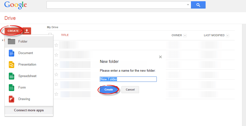
  • Access https://drive.google.com and log in with your Gmail account. After you logged in, click on the 'Create' button and add a new separate folder to upload your JavaScript and CSS files.
create folder in Google drive
  • Open the newly created folder, and click on the Upload button with the upward arrow to choose the files that you need to upload.
upload files using google drive
  • Now, navigate to the location where you saved the files, select them (to select multiple files, press and hold down the Ctrl key on your keyboard and then click on them) and press the Open button.
  • After the files have been successfully uploaded, right click on the file names (to select all your files in the folder, click on the checkbox) and select 'Share':
share google drive files
  • In the 'Sharing settings' window, click on the 'Change' link and choose the 'Public on the web' option. Press 'Save' and copy the link(s) of your uploaded file(s) from the 'Links to share' box highlighted in blue, then paste it into a Notepad to use it later.
javascript css file sharing

Step 3. How to Add an External CSS/JavaScript file to Blogger

Before you can use the links, you must replace 'https://drive.google.com/file/d' to 'https://googledrive.com/host' and remove '/edit?usp=sharing' in the link.

For example, the link to mycssfile.css that I copied looks like this:
https://drive.google.com/file/d/0B4n9GL3eVuV-TkphMkc3SFR2Slk/edit?usp=sharing
Notice the part in blue after the "/file/d/" part. That is the file ID which is used to access it via the new hosting service. It should start with the following URL:
https://googledrive.com/host/
Add the file ID like this (remove the '/edit?usp=sharing' part):
https://googledrive.com/host/0B4n9GL3eVuV-TkphMkc3SFR2Slk
Now log into your Blogger account, select your blog and go to Template > Edit HTML. Click anywhere inside the code area and press the CTRL + F keys to open the search box:

open blogger search box

If you want to add a CSS file, type the following tag inside the search box and hit Enter to find it:
<head>
Just BELOW the <head> tag, add this line:
<link rel="stylesheet" type="text/css" href="https://googledrive.com/host/0B4n9GL3eVuV-TkphMkc3SFR2Slk" />
And replace https://googledrive.com/host/0B4n9GL3eVuV-TkphMkc3SFR2Slk with the link of your CSS file:

add external css to blogger

If you want to add a Javascript file, search for the following tag:
</body>
And add this line just ABOVE it:
<script src='https://googledrive.com/host/0B4n9GL3eVuV-eVYwLXBrTlZrVDg' type='text/javascript'></script>
Replace the line in blue with your URL:

add external javascript js to blogger

Finally, press the 'Save template' button to save the changes. And you're done!

In Conclusion

Once you have saved all your file folders and closed out of the drive, open your site in a browser and make sure that all the changes have completed successfully.

Next time you want to edit any of the information or move internal files, all you have to do is open up the Google Drive folder on your account and make the modifications from that location. Those files will then automatically sync to the online folder and make updates to your site. This works the same if you want to change the appearance by modifying the CSS code to extend the header, footer, or make customizations.

As you can see, changing your file storage out so that is CSS and JavaScript is stored on your Google Drive account is easy to do and only takes a few minutes. After you make the change, you can begin benefiting from faster loading speeds, higher SEO rankings, and overall a more convenient platform to work from to increase the efficiency of your work.

How to Center the Blogger Header Image

The header of a website is what distinguishes your blog; it's your identity or digital fingerprint. Whenever a visitor accesses your blog for the first time, the header is one major aspect that is used to determine who you are and the type of content that they can expect to read. Therefore, it's important to develop a header that is both prominently placed and telling of your brand name.

What would seem to be counterintuitive to that idea is the default Blogger settings for header positioning. Whenever you upload a header to the site, it will automatically be aligned to the left of the page. Some Blogger users may be okay with this setting, especially if they are using a header design that doesn't contain a background. Others may find that their background headers appear cut off, incomplete, or indistinguishable from the rest of their content.

If you find yourself in the second category of users, there is a way to adjust the positioning of your header so that it is displayed as a center Blogger header. By centering your site header, you have greater flexibility over the overall design, and it allows you to really shine light on this content. It's hard to miss a header that is placed smack dab in the middle of the screen on every page that someone navigates to.

Center Header Image with Blogger Template Designer


center blogger header

Making the change is relatively easy. You'll be able to make these adjustments on every page of your Blogger blog without having to change them individually. All you need to do is to modify the CSS of your blog that can be found directly through your Blogger dashboard. Even if you have little to no experience in web design or coding, you can center Blogger header by following these next few steps.

Step 1. Log in your blogger account and select your blog, then go to "Template" and click the "Customize" button on the right side.

center blogger header

Step 2. Navigate to "Advanced" > "Add CSS" tab and paste the code in the empty box:
#header-inner {
background-position: center !important;
width: 100% !important;
text-align: center;
}
#header-inner img {
margin: auto;
}
If you have a small image and you want it to become full width, add this CSS instead:
#header-inner {
 background-size: cover;
 width: 100% !important;
 text-align: center;
 }
 #header-inner img {
 width: 100%;
 height: 100%;
 }

Step 3. Hit the ENTER key after you paste the code snippet, then click the "Apply to Blog" button.

blogger header centered

Here are some other aligning options for your headers:

Align Blogger Header Banner and Text Side by Side

Image on the right and title on the left

#header-inner {
background-position: right !important;
width: 100% !important;
}
.titlewrapper, .descriptionwrapper {
float: left;
clear: both;
margin-left: 20px;
}

Image on the left and title on the right

#header-inner {
background-position: left !important;
width: 100% !important;
}
.titlewrapper, .descriptionwrapper {
float: right;
clear: both;
margin-right: 20px;
}
Note: for larger images, you may need to resize them in order to make them appear side by side with the text.

That's it!
After making the changes to the CSS and saving your modifications, you may navigate back to your homepage. Refresh the page and you'll notice that the header is now centered, instead of on the left. Click on a few of your page links and make sure that this modification has been made to every page or post on the blog.

If by chance you don't see the changes to the header, go back through the code that you modified and make sure that you have copied and pasted the information into the file exactly as instructed. Even minor modifications in the code, or a missing semicolon may fail to make the changes you are trying to achieve, or come away with different results than what's expected.

The great thing about CSS is that it is your site's central hub for all things design. From the CSS file, you can modify just about any appearance on your site to give the blog a custom look and feel. Once you're comfortable performing minor adjustments to the appearance of your site, you can start to get creative and come up with your very own modifications.

Make Blogger Header, Navigation and Footer Full Width

Blogger is a user-friendly service that provides a lot of really attractive looking default templates for those just starting out. Default templates come in handy, but the nice things about owning your own blog is that you have the chance to add your own personal touch. As a matter of fact, templates aren't made to restrict your freedom of design, but instead they're there to provide you a foundation to build from. With every default template available on Blogger, you can make changes to fit your style.

One of the most common requests out of the Blogger community when making alterations is how to change the look of some of the key sections like header, navigation, and footer. Initially, these items are designed to fit within just 1/3 of the page, surrounded by padding and margins on either side. These margins are used to give the page a slim fitting appearance, but could also cause your content to look compressed.

Important: Backup your Template

Making the changes to a full screen Blogger navigation, footer, or header can be done and won't take you much time. Before you can make any changes, you should save extra copies of the template .xml file in case anything goes wrong. That way, if you don't like it or it doesn't come out looking like it should, you can reuse the contents of the original file to restore your blog to working condition.

Demo

Hover your mouse over the image to see a before and after example:


How to Make Header, Navigation and Footer Full Width in Blogger

Step #1: Access Your CSS File

If you've never opened up your CSS file before, log in to your Blogger account, select your blog and navigate to Template > Edit HTML. This will bring up the code of your template containing all your blog's internal files in one place.

Step #2: Modify the Background

Click anywhere inside the code area > press CTRL + F keys and type the following line > hit Enter to find it (stop at the first occurrence of it):
body {
Just below body { you should see some lines that will look like this:
body {
font: $(body.font);
color: $(body.text.color);
background: $(body.background);
padding: 0 $(content.shadow.spread) $(content.shadow.spread) $(content.shadow.spread);
$(body.background.override)
}
Where you see the highlighted line above in the code, remove the line and replace it with:
padding: 0px;
Different templates will have minor variations, but you should still be able to find these lines within every template.

Step #3: Change the Content Section

Next, search using the CTRL+F keys for this part:
.content-inner {
Just below it, you will see this line:
.content-inner {
padding: $(content.padding) $(content.padding.horizontal); 
}
Remove the line in red and replace it with:
padding: 0px;
This will remove any of the padding around the inner content, so it won't leave any room on both sides.

Now find this part:
$(content.background.color.selector){
Just below it you will see this line:
$(content.background.color.selector){
background-color: $(content.background.color);
}
Replace the line in red with:
background-color: $(body.background);
Finally, search for this tag:
]]></b:skin>
And just above it, add this CSS:
.main-outer {
background: $(content.background.color);
}

Step #4: Make the Content Outer Full Width

Content is displayed differently between browsers, so you'll next want to fix this so that it alters the width across the board. This code can be found searching for:
.content-outer, .content-fauxcolumn-outer, .region-inner {
And just below it you will see the following lines:
.content-outer, .content-fauxcolumn-outer, .region-inner {
min-width: $(content.width);
max-width: $(content.width);
_width: $(content.width);
}
Delete the line in red and replace that line with:
max-width: 100%;

Step #5: Finish It Up

Now you have just two more lines you need to change. Look for:
</b:template-skin>
And click on the right arrow to expand the styles. Note: you will need to search for </b:template-skin> tag again, and just before it you'll see these symbols highlighted in yellow:
]]>
</b:template-skin>
Above this ]]></b:template-skin> section of code, add the following:
.main-outer {
max-width: $(content.width);
margin: 0 auto;
}
Then run a search for:
]]></b:skin>
Add these lines of code just before/above it:
.tabs-inner {
padding: 0px;
}
.section {
margin: 0px;
}
.header-inner .widget {
margin: 0px;
}
Save the template and exit out of the editor.

Finished!

Following along with this tutorial won't affect or alter the pictures you are using on the blog, just the design of the content area. If you have a logo that stretches across the screen and fits perfectly for 1/3 page header, you will need to resize and re-upload this content so that it is able to work with the new adjustments.

Automatically Resize Blogger Images to Fit Blog Post Area

resize blogger images automatically
Blogger offers most of the tools you would need to add and resize Blogger images quick and easy. You can upload photos directly on the platform and even change the dimensions based on the type of content that you are attempting to produce.

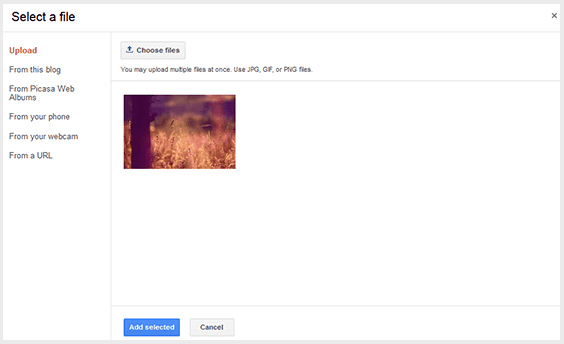
In order to do this, create a post and click on the small photo icon on the top toolbar next to the font style settings. A pop-up will show up on your screen asking you where you'd like to upload the image source. You have a choice between adding pictures from:
  • Your local computer
  • Previously uploaded images on the blog
  • Picasa Web Albums
  • An image URL
upload blogger image

Once you select the image that you want to use, you'll see four image sizes to choose from - small, medium, large, and x-large; it also gives you the option to determine the alignment. If you find that the four preset dimensions aren't providing the outcome you desire, there are easy ways to resize Blogger images to custom dimensions in order to fit your blog post area.

Step #1: Retain the Image Quality

If you know that you are going to need to resize Blogger images once you post them to your blog, make sure that you start with a photo larger than the 640px dimensions of the x-large option. It's easy to bring an image down in size, but if you try to make a small image bigger, you'll lose some of the quality. Just make sure that you watch out for the file size containing the image; the larger the file, the slower it will load on your website.

Photoshop is a powerful image editor that can help you to resize Blogger images or modify your images before you post, but it is also an expensive investment. There are also many other freeware image editors that can perform the simple task of resizing the photo. Determine what size you'd like the photo to display on the page and manually resize Blogger images to those dimensions; other users have found that 700px is a pretty flexible width size that works well on posts.

Once you've got your photo resized and added to your post, click on it and choose the 'Original size' option. If your photos are going to exceed the post editor, it probably means that they are larger than the body of your post, so let's fix that and make them fit exactly.

set image to original size

Step #2: Modify The Site's CSS

Next, you'll want to modify the CSS of your Blogger template to accommodate the adjustments. Don't worry; you won't need much coding experience to complete this task.

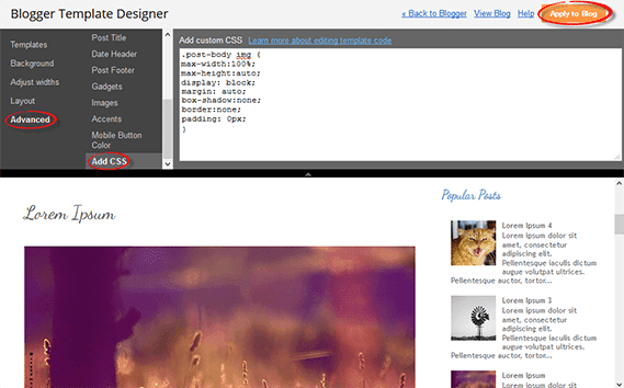
Open up the Blogger dashboard and go to 'Template' > 'Customize'. You'll see the option for 'Advanced', click on it and find your way to the 'Add CSS' tab... paste the following CSS code inside the empty box:
.post-body img {
max-width: 100%;
max-height: auto;
display: block;
margin: auto;
}
Adding the code to this section, automatically adds it between the <b:skin>....<b:skin> tags of your Template (Template > Edit HTML, above the ]]></b:skin> tag). So, no matter whether you add it above ]]></b:skin> or within the Add CSS box, the effect should be the same.

Remember that when you make changes to the CSS of the blog's Template, these changes will affect every post previously added, using the "Original size" dimension option.

To spruce up the post even more, add the last three lines shown in green below:
.post-body img {
max-width: 100%;
max-height: auto;
display: block;
margin: auto;
box-shadow: none;
border: none;
padding: 0px;
}

resize blogger pictures

This code will get rid of any borders and padding around the image and give it a much more natural look within the post. Hit the "Apply to Blog" button once you've finished adding it.

Note: This will only change the images set to Original size. To resize images with different sizes and apply this change on ALL the pictures added to your posts, add this CSS instead:
.post-body img {
width:100%;
height:100%;
display: block;
}
Please consider that, if you have posts with photos floating either on the right or left side of the content, they will automatically go full width.

Step #3: Create A Post

After making the adjustments to both file size and CSS, you may go back to the post editor and repeat the Step 1 to add an image. When you return to the screen that asks for size, click on the "Original size" option and confirm your choice. Your newly added image will then be displayed with the adjustments that you created, so that it fits nicely the width of the post area.

Responsive CSS Timeline with 3D Effect for Blogger

Here's another amazing way to display the Blogger posts. By applying the following Responsive CSS Timeline View with 3D Effect on Blogger Posts, we will have a responsive timeline-like structure of our most recent posts with thumbnails, plus some cool CSS effects. When clicking on the associated radio input, the posts snippet/summary will expand by changing their style and size and will rotate in 3D. The main structure of this CSS timeline with 3D effect is an unordered list.

To get an idea of how it looks like, you can visit this demo blog.

responsive CSS timeline, customize blogger posts

How to Add Responsive CSS Timeline View to Blogger Posts

Step 1. Go to Blogger dashboard > "Template" > click on the "Edit HTML" button:

blogger template, edit html

Step 2. Click anywhere inside the code area and press the CTRL + F keys to open the search box:

blogger search box

Step 3. Type or paste the following tag inside the search box and hit Enter to find it:
</head>
Step 4. Just above the </head> tag, copy and paste the following style:
<b:if cond='data:blog.pageType != &quot;static_page&quot;'>
<b:if cond='data:blog.pageType != &quot;item&quot;'>
<style type='text/css'>
.post-body img, .post-body .tr-caption-container, .Profile img, .Image img,
.BlogList .item-thumbnail img {padding: 0px; border: 0px;}
.post-footer {display: none;}
.post {margin-bottom: 50px; padding-bottom: 0px; background: none; border: none;}
.jump-link a {display: none;}
  h3.post-title a {display: none;}
 .date-header {display: none;}
*,
.timeline:after,
.timeline:before {box-sizing: border-box;padding: 0; margin: 0;}
.timeline {position: relative;padding: 30px 0 50px 0;font-family: Arial, sans-serif;}
.timeline:before {content: &#39;&#39;;position: absolute;width: 5px;height: 100%;margin:0px;top: 0;left: 200px;background: url(data:image/png;base64,iVBORw0KGgoAAAANSUhEUgAAAAUAAAAFCAYAAACNbyblAAAAJUlEQVQIW2NkQAP/gYARWQwkAOLDBeECjEAAkkEWAKtEFwAJAgAZEBP+oM1IkwAAAABJRU5ErkJggg==);}
.event {position: relative;margin-bottom: 80px;padding-right: 40px;}
.thumb {position: absolute; width: 90px; height: 90px;box-shadow:
        0 0 0 8px #87939E,
        0 1px 1px rgba(255,255,255,0.5);background-repeat: no-repeat;border-radius: 50%;-webkit-transform: scale(0.8) translateX(24px);-moz-transform: scale(0.8) translateX(24px);-o-transform: scale(0.8) translateX(24px);-ms-transform: scale(0.8) translateX(24px);transform: scale(0.8) translateX(24px);}
.thumb:before {content: &#39;&#39;;background: transparent url(data:image/png;base64,iVBORw0KGgoAAAANSUhEUgAAAAoAAAAICAYAAADA+m62AAAAPElEQVQYV2NkQAP/gYARCNDFUQRgirAphitEl0TngxXisg5ZnBGXIpgbYfIYjkb3BNxGbBLYxIgyEaQRAA8KKAWYsZtjAAAAAElFTkSuQmCC);position: absolute;height: 8px; z-index: -1; width: 50px;top: 42px; left: 100%;margin-left: 8px;
}
.thumb span {color: #87939E;width: 100%;text-align: center;font-weight: 700;font-size: 15px;text-transform: uppercase;position: absolute;bottom: -30px;}
.event label,.event input[type=&quot;radio&quot;] {width: 24px;height: 24px;left: 158px;top: 36px;position: absolute;display: block;}
.event input[type=&quot;radio&quot;] {opacity: 0;z-index: 10;cursor: pointer;}
.event label:after{content: &quot;\2713&quot;;background: #8995A1;border-radius: 50%;color: #fff;font-size: 20px;height: 100%;width: 100%;font-weight: bold;left: -2px;top: -3px;line-height: 24px;position: absolute;text-align: center;}
.content-perspective { margin-left: 230px;position: relative;perspective: 600px;-webkit-perspective: 600px;-moz-perspective: 600px;-o-perspective: 600px;-ms-perspective: 600px;}
.content-perspective:before { content: &#39;&#39;; width: 34px; left: -44px; top: 48px;position: absolute;height: 1px; z-index: -2;background: #fff;}
.post-content {transform: rotateY(10deg);transform-origin: 0 0;transform-style: preserve-3d;}
.blog-post-body {position: relative;padding: 20px;color: #333; border-left: 5px solid #8995A1;box-shadow: 0 4px 6px rgba(0,0,0,0.1);background: #F9F9F9;}
.blog-post-body h3 {border: none;margin: 0px;}
.blog-post-body h3 a{font-size: 21px;padding: 5px 0 5px 0;color: #86919D;margin: 0px;text-decoration: none;border: none;}
.event input[type=&quot;radio&quot;]:checked ~ .content-perspective .blog-post-body h3 a{color: #F26328;}
.blog-post-body p,.thumb span,.event label {-webkit-backface-visibility: hidden;}
.blog-post-body p {font-size: 15px;max-height: 0px; overflow: hidden; color: rgba(0,0,0,0);text-align: left;}
.blog-post-body:before {content: &#39;\25c2&#39;;font-weight: normal; line-height: 86px; font-size: 86px;position: absolute;color: #8995A1; left: -41px;width: 100%;height: 100%; top: 3px;z-index: -1;}
.thumb,.thumb span,.blog-post-body h3 {transition: all 0.6s ease-in-out 0.2s;-webkit-transition: all 0.6s ease-in-out 0.2s;-moz-transition: all 0.6s ease-in-out 0.2s;-o-transition: all 0.6s ease-in-out 0.2s;-ms-transition: all 0.6s ease-in-out 0.2s;transition: all 0.6s ease-in-out 0.2s;}
.blog-post-body { transition: box-shadow 0.8s linear 0.2s;-webkit-transition: box-shadow 0.8s linear 0.2s;-moz-transition: box-shadow 0.8s linear 0.2s;-o-transition: box-shadow 0.8s linear  0.2s;-ms-transition: box-shadow 0.8s linear 0.2s;}
.post-content {transition: transform 0.8s cubic-bezier(.59,1.45,.69,.98) 0.2s;-webkit-transition: -webkit-transform 0.8s cubic-bezier(.59,1.45,.69,.98) 0.2s;-moz-transition: -moz-transform 0.8s cubic-bezier(.59,1.45,.69,.98) 0.2s;-o-transition: -o-transform 0.8s cubic-bezier(.59,1.45,.69,.98) 0.2s;-ms-transition: -ms-transform 0.8s cubic-bezier(.59,1.45,.69,.98) 0.2s;}
.blog-post-body p { transition: max-height 0.5s linear, color 0.3s linear;-webkit-transition: max-height 0.5s linear, color 0.3s linear;-moz-transition: max-height 0.5s linear, color 0.3s linear;-o-transition: max-height 0.5s linear, color 0.3s linear;-ms-transition: max-height 0.5s linear, color 0.3s linear;}
.event input[type=&quot;radio&quot;]:checked + label:after {content: &#39;\2714&#39;;color: #fff;background: #F26328;box-shadow: 0 0 0 5px rgba(255, 255, 255, 0.8);}
.event input[type=&quot;radio&quot;]:checked ~ .content-perspective:before {background: #F26328;}
 .event input[type=&quot;radio&quot;]:checked ~ .content-perspective .blog-post-body h3 { color: #F26328;}
.event input[type=&quot;radio&quot;]:checked ~ .content-perspective .post-content {transform: rotateY(-5deg);-webkit-transform: rotateY(-5deg);-moz-transform: rotateY(-5deg);-o-transform: rotateY(-5deg);-ms-transform: rotateY(-5deg);}
.event input[type=&quot;radio&quot;]:checked ~ .content-perspective .blog-post-body {border-color: #F26328;box-shadow: 10px 0px 10px -6px rgba(0, 0, 0, 0.1);}
.event input[type=&quot;radio&quot;]:checked ~ .content-perspective .blog-post-body p {max-height: 460px; color: rgba(0,0,0,0.6); transition-delay: 0s, 0.6s;-webkit-transition-delay: 0s, 0.6s;-moz-transition-delay: 0s, 0.6s;-o-transition-delay: 0s, 0.6s;-ms-transition-delay: 0s, 0.6s;}
.event input[type=&quot;radio&quot;]:checked ~ .content-perspective .blog-post-body:before {color: #F26328;}
.event input[type=&quot;radio&quot;]:checked ~ .thumb {transform: scale(1);box-shadow: 0 0 0 8px rgba(242,99,40,1), 0 1px 1px rgba(255,255,255,0.5); -webkit-transform: scale(1);-moz-transform: scale(1);-o-transform: scale(1);-ms-transform: scale(1);}
.event input[type=&quot;radio&quot;]:checked ~ .thumb span {color: #F26328;}
.event input[type=&quot;radio&quot;]:checked ~ .thumb:before {
background: transparent url(data:image/png;base64,iVBORw0KGgoAAAANSUhEUgAAAAoAAAAICAYAAADA+m62AAAAPUlEQVQYV2NkQAOfUjX+882+wYgujiIAU4RNMVwhuiQ6H6wQl3XI4oy4FMHcCJPHcDS6J2A2EqUQpJhohQBbNyaHFmzEqgAAAABJRU5ErkJggg==);}
@media screen and (max-width: 850px) {.blog-post-body h3 {font-size: 20px;}
 .blog-post-body p { font-size: 14px; text-align: justify; }
 .event input[type=&quot;radio&quot;]:checked ~ .content-perspective .blog-post-body p { max-height: 500px; }}
@media screen and (max-width: 540px) {.timeline:before { left: 50px;}
.event {padding-right: 0px; margin-bottom: 100px; }
 .thumb { transform: scale(0.8); -webkit-transform: scale(0.8);-moz-transform: scale(0.8);-o-transform: scale(0.8);-ms-transform: scale(0.8);}
 .event input[type=&quot;radio&quot;] { width: 100px;height: 100px;left: 0px;top: 0px; }
.thumb:before,.event input[type=&quot;radio&quot;]:checked ~ .thumb:before {background: none;width: 0;}
 .event label {display: none;}
 .content-perspective {margin-left: 0px;top: 80px;}
 .content-perspective:before {height: 0px; }
 .post-content { transform: rotateX(-10deg);-webkit-transform: rotateX(-10deg);-moz-transform: rotateX(-10deg);-o-transform: rotateX(-10deg);-ms-transform: rotateX(-10deg);}
 .event input[type=&quot;radio&quot;]:checked ~ .content-perspective .post-content { transform: rotateX(10deg);-webkit-transform: rotateX(10deg);-moz-transform: rotateX(10deg);-o-transform: rotateX(10deg);-ms-transform: rotateX(10deg);}
.blog-post-body {border-left: none;border-top: 5px solid #8995A1;}
.event input[type=&quot;radio&quot;]:checked ~ .content-perspective .blog-post-body {border-color: #F26328;box-shadow: 0 10px 10px -6px rgba(0, 0, 0, 0.1);}
.blog-post-body:before {content: &#39;\25b4&#39;;left: 33px; top: -32px;}
.event input[type=&quot;radio&quot;]:checked ~ .content-perspective .blog-post-body p {max-height:300px; }}
ul.timeline {list-style-type: none;}
</style>
</b:if>
</b:if>

Step 5. Search for the SECOND instance of this code below (hit Enter two times):
<data:post.body/>
Note: depending on the template you are using, you could find more lines like this one above. Thus, if you don't see any changes after saving the template, try to replace the last one, as well.

Also, please note that if you are using the Read more function, you will need to remove it in order to make it work.

Step 6. After you found <data:post.body/>, replace it this HTML code:
<b:if cond='data:blog.pageType != &quot;static_page&quot;'>
<b:if cond='data:blog.pageType != &quot;item&quot;'>
<ul class='timeline'><li class='event'><input checked='checked' name='tl-group' type='radio'/><label/>
<b:if cond='data:post.thumbnailUrl'><img class='thumb' expr:alt='data:post.title' expr:src='data:post.thumbnailUrl'/></b:if><div class='thumb'><b:if cond='data:post.dateHeader'><span><data:post.dateHeader/></span></b:if></div>
<div class='content-perspective'><div class='post-content'><div class='blog-post-body'><h3><b:if cond='data:post.link'><a expr:href='data:post.link'><data:post.title/></a><b:else/><b:if cond='data:post.url'><b:if cond='data:blog.url != data:post.url'><a expr:href='data:post.url'><data:post.title/></a><b:else/><data:post.title/></b:if><b:else/><data:post.title/></b:if></b:if></h3><p><b:if cond='data:blog.pageType != &quot;item&quot;'>
<b:if cond='data:blog.pageType != &quot;static_page&quot;'><data:post.snippet/></b:if></b:if></p></div></div></div></li></ul></b:if></b:if>
<b:if cond='data:blog.pageType == &quot;item&quot;'><data:post.body/></b:if>
<b:if cond='data:blog.pageType == &quot;static_page&quot;'><data:post.body/></b:if>
Step 7. Finally, click on the "Save template" button to save the changes.

Now, we will need to make some small adjustments in order to make the posts date appear correctly:
Go to "Layout" and click on the "Edit" link just below the Blog posts area. When the pop-up window appears, check the date option and choose to display the date in the following order (date/month/year):


Note that you can also hide the posts date by unchecking this option.

Finally, click on the "Save" button and that's it! View your blog and enjoy this Responsive Timeline view with 3D Effect on Blogger posts.

Credit: tympanus.net

What is the difference between padding and margins?

For those who would like to know more about HTML and CSS, in this post we will learn the differences between margin and padding CSS properties that are used to add space between the HTML elements, thus preventing the elements from getting 'stuck' together.

Although both have similar functions, each work in a different way.
  1. Padding determines the inner margins, being used for changing the distance between the content of a given element and its border.
  2. Margin is the space outside of an element affecting how far the element is away from other elements.
For a better understanding of how the padding and margin work, take a look at the picture below:

padding and margin, css proprieties
Difference between margin and padding

Just as you have the option to define the borders for each side of your HTML elements (eg. borders for the sidebar), you can do the same with the margin and padding properties. All you need to to do is to change the top, right, bottom and left values​​.

The values that you can use include: pixels (px), centimeters (cm), millimeters (mm). em units (em), x-height (ex), inches (in), picas (pc) and point sizes (pt).

When using margin and padding, you need to add a value for each 4 corners of an element, as follows: top, right, bottom, left. Each value must refer to the each side of the HTML element. The first value is for the top, and they follow a clockwise direction, so the value would be close to the right, then bottom, and finally, left.

Example 1:
padding:5px 15px 5px 15px;
  • top padding is of 5px 
  • right padding is of 15px 
  • bottom padding is of 5px 
  • left padding is of 15px
margin: 10px 5px 10px 5px;
  • top margin is of 10px
  • right margin is of 5px
  • bottom margin is of 10px
  • left margin is of 5px
If you define a single value (instead of 4), the distance applies on the all sides, i.e. it will be applied on the 4 sides of the HTML element that you want to modify.

Example 2:
padding: 5px (top and bottom) 15px (left and right);
margin: 10px (top and bottom) 5px (left and right);

If it helps you visually, think of an A4 page of type inside a picture frame. The margin is the space between the edge of the sheet of paper and the other elements (the parts of the frame), while the padding would be the space between the edge of the sheet and where the type starts on the page. The border would be the edge of the sheet of paper.

It's probably easier to understand if you have borders, then it also becomes obvious which one to use. Do you want "space" after the border (outside the element = margin) or before the border (inside the element = padding).

How to Add CSS code To Blogger using Template Designer

If you are having difficulties adding the CSS codes in a Blogger template, here's a short guide that will show you a more practical and fast way to add CSS (Cascading Style Sheets) so that it will be easier for you to customize your blog.

Some users have complained that when they had to add the CSS codes to install some feature in Blogger, they found it difficult to locate the ]]></b:skin> tag. So, I decided to make this quick tutorial to show you another way of adding the CSS without having to access the Blogger HTML editor.

Adding CSS via the Blogger Template Designer

Step 1. Log in to your Blogger account and select the blog that you want to customize.

Step 2. From the Blogger dashboard, choose "Template" and click on the "Customize" button.


Step 3. Click on the "Advanced" tab.

Step 4. Now just add your CSS code inside the "Add CSS" tab (if you have more options, you may need to scroll down the list). Here you can add any CSS code each time you want to apply a new style to your template.


Step 5. Once added, click on the "Apply to blog" button to save the changes.

Following this method, you can't edit the existing CSS styles already added in your template which will require to access the template's HTML and make the modifications there. Here, you can only add new styles and edit the existing styles added through the Blogger Template Designer panel.

Please note that when adding the CSS styles, there's no need to put the <style type="text/css"> ... </style> style tags, which usually would go above the </head> tag in the template's HTML code. Adding these tags may result in an error.

If you change the template, the CSS added here will be removed. The same goes for any other additions or CSS customizations made ​​through the template HTML editor. So this is how we can easily add CSS code to Blogger using Template Designer without having to search the ></b:skin> tag.

How to add custom Variable definitions to Blogger

In this tutorial, we are going learn about the CSS Variable Definitions for Colors and Fonts that could be found at the top of the style sheet of a Blogger blog. The values for the Variable definitions can be modified directly through the Blogger Template Designer where are the settings for colors, backgrounds, fonts and font sizes.
blogger variable definitions

Most default Blogger templates, such as the Minima Template, use these settings for the CSS, which makes it easier to modify the variables through the Blogger dashboard, using the Template Designer ("Template" > "Customize") editor and going to the "Advanced" section.

blogger template designer, variable definitions

If the definitions are already added in the CSS, we'll be able to change the background colors, font colors, styles or sizes, directly from our Blogger dashboard without having to touch the HTML code of our template.

If these values ​​are not set, we can define them by creating our own variables. The more variables are created, the greater will be the ease of changing colors and fonts of the Page Elements by going to the "Template Designer" and click on the "Advanced" tab.

In some cases, we can't change the color or font of a custom template if the designer has not implemented the variables and didn't defined & specified a particular value directly into a property. And if there is no definition for these values​​, we may not be able to customize it through the Blogger's Template Designer.

There are two types of variables:

1) Color Variable:
<Variable name="body.background.color" description="Outer Background" type="color" default="#66bbdd" value="#66bbdd"/>
  • In red is the variable name. Here you can put any name you want, however, it must not contain spaces, that's why we may see some variable names using a dot "." between each word.
  • In green is the description that will appear in the Fonts and Colors panel (it can contain spaces).
  • In blue is variable type, which in this case is "color".
  • In purple is the default value, which runs in the absence of any other value.
  • In orange is the value of the selected color.
2) Font Variable:
<Variable name="body.font" description="Font" type="font" default="normal normal 12px Arial, Tahoma, Helvetica, FreeSans, sans-serif" value="normal normal 12px Arial, Tahoma, Helvetica, FreeSans, sans-serif" />
  • In red the variable name without spaces.
  • In green the description of the variable, may contain spaces.
  • In blue is the type of the variable, which in this case is font.
  • In purple the default font.
  • In orange is the font that you choose.

Where Are Variable Definitions located

We can find the variables definitions in the <head> section of our Template by accessing the HTML code (click on the "Edit HTML" button). There we should see a pair of <b:skin>..</b:skin> tags. The CSS style declarations will go in between those tags, along with the variable names.

variable definitions

How to Create Variables with type Color

Now, let's see how we can create type="color" variables in our template.

Please copy the below snippet and replace the names and types as you like, then paste the code below this comment:
/* Variable definitions
   ====================
Code to copy:
 <Variable name="NAME" description="DESCRIPTION" type="color" default="#xxxxxx" value="#xxxxxx" />
For a better understanding, let's take a look at this example with variable of type "color":
<Variable name="variablecolor" description="Variable with light blue color" type="color" default="#DDF2FF" value="#DDF2FF" />
color variable type

Here, I have created a variable of type "color", with the "variablecolor" name. The color values (#DDF2FF) can be applied to all the borders of my blog and whenever I want to apply color styles to a specific border, I will type it like this:
border: 1px solid $(variablecolor);
Note that I have added the "$" symbol before the variable's name and included the name inside the parentheses. These should be added every time you want to implement a new variable definition.

Once we have created the variable, we can apply it on any property (not only borders) of any selector (page element) where it is possible applying the chosen color.

For example, if I want to add this color in the main-inner background (sidebar and posts area), I will add it just after the "main-inner" class selector, like this:
.main-inner {
background-color: $(variablecolor);
}
variable type color, variable definitions

Now that a new variable has been added, save and return back to the blogger dashboard by clicking on the "Customize" button, then the "Advanced" tab. You will notice that there is a new variable called "Variable with light blue color". In order to change the color, just use the color picker tool.

blogger template designer

How to Create Variables of type Font

Now let's say that I want to create a new variable of type="font" which I want to apply on the title of the sidebar gadgets. I will add it this way:
<Variable name="gadgetstitlefont" description="Gadgets Title Font" type="font" default="normal normal 16px Arial,Verdana,'Trebuchet MS',Trebuchet,Sans-serif"  value="normal normal 20px Cambria"/>
In this variable that I just created, the default font to be searched by the web browser should be Arial, and in its absence, Verdana and so on. Otherwise, apply the Cambria font which is actually the font that we want and which can be easily changed by accessing the Blogger Template Designer.

Once the font variable has been implemented, we can add it to any property of any selector where we want to define this font style.

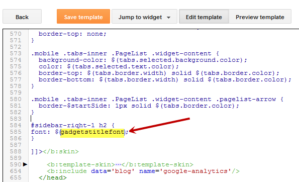
To define where this variable should be applied (which, in my example, is the title of the sidebar gadgets), I will need to include the values ​​directly in the "h2" property of the "sidebar" selector (sidebar-right-1), by creating the following CSS rule:
#sidebar-right-1 h2 {
font: $(gadgetstitlefont);
}
And I will add this above the ]]></b:skin> tag of the Template (don't forget to add the "$" symbol before the variable's name, also put the name between the parentheses, otherwise it won't work).

variable font type

Now, that we have included a new variable, Save the template and return to the Blogger dashboard by clicking on the "Template" > "Customize" button and access the "Advanced" tab. Scroll down and we will see a new variable named "Gadgets Title Font" - if you want to change the font type or size, you can do it directly via this panel.

variable font type advanced

After you've decided what font style should be applied, click on the Apply to blog button on the right side.

apply to blog button

As you work on your template design, you can add lots of color and font variable types, however, for other types of CSS attributes, it is not necessary to create variables. The other types, such as margin, padding, need to be included in the HTML of the template above the ]]></b:skin> tag. So that's how you can add custom variable definitions to Blogger. Enjoy!

CSS3 Transition Property Basics

While browsing some sites, we can see an interesting effect on some links. Most of the time, when you hover over a link, something changes in its style: it will either change its color or background, or will become underlined.

What about this cool effect that consists in gradual transition from one style to another that you can see in the example below:
Hover Over Me!

This transition is achieved by using the CSS3 transition property - property which is supported in all major browsers such as Chrome, Firefox, Opera, Safari (for Safari we will need the -webkit- prefix to get this effect).

The CSS3 Transition Syntax

The syntax of the transition supports four values:
  • the property affected by the transition, such as color, border, background, width, etc.
  • the duration of this transition in seconds, i.e. how long will it take to change your style completely
  • the delay time for the transition to be executed, also in seconds, i.e. how long it takes for the transition to start when the mouse hovers over that element;
Check out the code below:
.example {
 transition-property: width; /* property that undergoes a transition */
 transition-duration: 2s; /* duration of the transition */
 transition-timing-function: linear; /* timing-function */
 transition-delay: 0; /* length of time to delay the start of a transition */
/* now we will repeat the entire declaration with the -webkit- prefix for the effect to work in Chrome and Safari */
 -webkit-transition-property: width;
 -webkit-transition-duration: 2s;
 -webkit-transition-timing-function: linear;
 -webkit-transition-delay: 0;
}
In the example above, the elements with the .example class will become wide within two seconds as the mouse passes over them.

When we define the style of a link, usually we need to use the a:link selector, and when defining the style when the mouse is over the link, we need to use the :hover selector. However, the transition can be used in any HTML element, not just links.

To make the transition effect to work properly, we should define two blocks of style for that element, i.e. the normal style for a tag/id/class and the style on mouse :hover for a specific tag/id/class.

For example:
tag, #id, .class {
/* insert here the styles that you want for the selector */
/* insert below the transition effects */

}
tag:hover, #id:hover, class:hover {
/* Insert here the styles for when the mouse is over the element */
/* here it is not necessary to repeat the declaration of the transition */

}
You can add the same style on multiple selectors separated by commas as you can see above, although it is not necessary.

Below are some transition examples with their respective CSS codes. I will not use the transition-timing-function in these examples because it makes no difference, as the first value is the duration in seconds and the second is the delay.

Example 1:

Transition example

/* with a single property */
#example1 {
 background-color: #FFFF00;
-moz-transition-property: background-color;
-moz-transition-duration: 2s;
-webkit-transition-property: background-color;
-webkit-transition-duration: 2s;
-o-transition-property: background-color;
-o-transition-duration: 2s;
}
#example1:hover {
background-color: #B5E2FF;
}

Example 2:

Transition example

/* with four properties and delay */
#example2 {
background-color: #9c3;
border: 8px solid #690;
padding: 20px;
color: #fff;
-moz-transition-property: background-color,border;
-moz-transition-duration: 1s;
-webkit-transition-property: background-color,border;
-webkit-transition-duration: 1s;
-o-transition-property: background-color,border;
-o-transition-duration: 1s;
}
#example2:hover {
background-color: #690;
border: 8px dashed #fff;
color: #FFFF00;
-moz-transition-property: background-color,border;
-moz-transition-duration: 2s;
-webkit-transition-property: background-color,border;
-webkit-transition-duration: 2s;
-o-transition-property: background-color,border;
-o-transition-duration: 2s;
}
Example 3:

Transition example

/* with seven properties and delay */
#example3 {
padding: 15px;
background-color: #FF7CA6;
font-size: 16px;
width: 30%;
font-weight: bold;
color: #fff;
height: 20px;
-moz-transition-property: background-color,width,height,padding,font-size,color;
-moz-transition-duration: 1s;
-webkit-transition-property: background-color,width,height,padding,font-size,color;
-webkit-transition-duration: 1s;
-o-transition-property: background-color,width,height,padding,font-size,color;
-o-transition-duration: 1s;
}
#example3:hover {
background-color:#9c3;
width: 60%;
height: 60px;
padding: 50px;
font-size: 30px;
color: #FFFF00;
-moz-transition-property: background-color,width,height,padding,font-size,color;
-moz-transition-duration: 2s;
-webkit-transition-property: background-color,width,height,padding,font-size,color;
-webkit-transition-duration: 2s;
-o-transition-property: background-color,width,height,padding,font-size,color;
-o-transition-duration: 2s;
}
Example 4:

Transition example

/* with all the properties simultaneously */
#example4 {
padding: 15px;
background-color: #9c3;
color: #fff;
font-size: 16px;
width: 30%;
font-weight: bold;
transition: all 2s;
-webkit-transition: all 2s;
}
#example4:hover {
background-color: #FF7CA6;
color: #242424;
width: 60%;
}

Final words:

  • the transition declarations need to appear in the CSS. In Blogger, the CSS is located before ]]</b:skin>
  • as you can see in the examples above, you can assign different rules for the transitions of different elements in a single rule - just separate them with commas.
  • it is not mandatory to use the four properties in the transition declaration, but their order must always look like this: property/duration/timing-function/delay.
  • the duration and delay values ​​must be expressed in seconds, but sometimes a second is a long time for a transition. In this case, you can use values with milliseconds, for example, .5s means half a second.
  • In small time intervals, the timing of the transition-function property does not give a remarkable effect being most useful only in more advanced animations. The possible values are either ease (the default, which makes the transition with a slow beginning, then gets faster and ends slowly), linear (the same transition speed from beginning to end), ease-in (transition begins slowly and then the speed increases), ease-out (transition starts fast and slows down at the end) and ease-in-out

How to Increase Thumbnail Resolution on Blogger

When we add a widget on Blogger, the thumbnails will maintain a default size of 72 x 72px which might not look good if we try to make them larger using only CSS. However, with a bit of JavaScript we'll be able to replace the thumbnail with the same image of higher resolution and this way, larger images will no longer appear blurry.

So this tutorial will show you how to increase the thumbnail resolution size of the popular posts Blogger widget, even though we can apply this trick on any of the blog widgets.


Changing the Thumbnail Size for the Popular Posts Widget

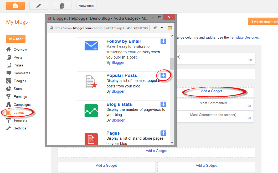
Step 1. First, let's add the Popular posts gadget by going to "Layout" > click on the "Add a gadget" link and select "Popular Posts" from the popup window.

adding popular posts gadget

Step 2. Next, go to "Template" > click on the "Edit HTML" button > click anywhere inside the code area to open the Blogger search box using the CTRL + F keys.

edit blogger template html

Step 3. Type or paste the following tag inside the search box then hit Enter to find it:
</head>
After you found the </head> tag, add this CSS above it:
<style type='text/css'>
.PopularPosts .item-thumbnail a {
clip: auto;
display: block;
height: 130px;
margin: 0 0px 5px;
overflow: hidden;
width: 210px;
border: 2px solid #EEEEEE;
border-radius: 20px;
}
.PopularPosts .item-thumbnail img {
position: relative;
top: -30px;
transition:all .2s linear;
 -o-transition:all .5s linear;
-moz-transition:all .2s linear;
-webkit-transition:all .2s linear;
}
.PopularPosts .item-thumbnail img:hover{
opacity:.6;
filter:alpha(opacity=60)
}
.PopularPosts .widget-content ul li {
background: #F9F9F9;
border: 2px solid #EEEEEE;
border-radius: 10px;
box-shadow: 0 4px 10px #EEEEEE;
color: #555555;
padding: 10px;
margin-bottom: 5px;
}
.PopularPosts .item-title {
clear: both
font: 14px Cambria,Georgia, sans-serif;
color: #2288BB;
font-weight: bold;
text-transform: uppercase;
text-align: center;
}
.PopularPosts .item-snippet {
display: none;
}
.widget .widget-item-control a img {
height: 18px;
width: 18px;
}
</style>
Step 4. Now search for this tag:
</body>
And just above it, add this script:
<script type='text/javascript'>                  
function changeThumbSize(id,size){
var blogGadget = document.getElementById(id);
var replacement = blogGadget.innerHTML;
blogGadget.innerHTML = replacement.replace(/w72-h72-p-k-no-nu/g,"s"+size+"-c");
var thumbnails = blogGadget.getElementsByTagName("img");
for(var i=0;i&lt;thumbnails.length;i++){
thumbnails[i].width = size;
thumbnails[i].height = size;
}
}
changeThumbSize("PopularPosts1",210);                  
</script>
Highlighted in red is the widget ID for the Popular Posts gadget. To change the thumbnail size for any of your blog widgets, find the gadget/widget ID and then add a line below this part:
changeThumbSize("PopularPosts1",210);
changeThumbSize("widget-ID-HERE",210);
Then replace widget-ID-HERE text with the ID of that widget/gadget.

Note: you won't see the changes if the widget has a class selector - for this you may need to change class with id and replace the dot ".>" symbol with "#" in the CSS code.

If you don't know how to find the id of a particular widget, please check out this tutorial on How to Use Firebug to Design a Blogger blog.

Step 5. Finally, press the "Save Template" to save the changes and this is how you can increase thumbnail resolution on Blogger. Enjoy!

Create a CSS3 Image Hover Effect with Animated Vinyl Record

Here is an amazing CSS image effect to reveal more information on your images with a really cool CSS3 hover animation. This is just perfect for blogs dedicated to music or if you just want to show off the music that you love.

So, what we will do in this tutorial is to take an image for our album cover, add some fancy CSS3 transitions and transforms that, on hover, will slide out a pure CSS vinyl record behind it. Finally, we will add some basic HTML to our post or page where we need to apply this amazing effect.

Demo: hover over the album cover and see how CSS reveals further information:

The Wall is the eleventh studio album by the English progressive rock group Pink Floyd.

How to Apply The Animated Vinyl Record on Blogger Images

Step 1. From your Blogger's Dashboard, go to "Template" > click on the "Edit HTML" button:


Step 2. Click anywhere inside the code area and press the CTRL + F keys to open the search box:
Step 3. Type or paste inside the search box the tag below and hit Enter to find it:
]]></b:skin>
Step 4. Just above ]]></b:skin> add the following code:


.info {
position: absolute;
z-index: 3;
top: 20%;
zoom: 1;
filter: alpha(opacity=0);
opacity: 0;
padding: 10px;
text-align: center;
color: #eee;
font-size: 13px;
font-weight: bold;
background: #333;
background: rgba(0,0,0,.7);
-moz-transition:all linear 0.5s 0s;
-webkit-transition:all linear 0.5s 0s;
transition:all ease 0.5s 0s;
}
.case:hover .info, .case:hover .vinyl {
filter: alpha(opacity=100);
opacity:1;
}
.case {
position:relative;
display:block;
width:185px;
height:185px;
-webkit-border-radius:3px;
border-radius:3px;
z-index:2;
-webkit-box-shadow: 0px 0px 2px 0px rgba(0, 0, 0, 0.2);
box-shadow: 0px 0px 2px 0px rgba(0, 0, 0, 0.2);
margin:0 auto;
}
.case:after {
position:absolute;
display:block;
content: "";
width:265px;
height:10px;
left:-40px;
bottom:-8px;
z-index:1;
background: -moz-radial-gradient(center, ellipse cover,  rgba(0,0,0,0.45) 0%, rgba(0,0,0,0) 50%, rgba(225,225,225,0) 51%, rgba(246,246,246,0) 100%);
    background: -webkit-gradient(radial, center center, 0px, center center, 100%, color-stop(0%,rgba(0,0,0,0.45)), color-stop(50%,rgba(0,0,0,0)), color-stop(51%,rgba(225,225,225,0)), color-stop(100%,rgba(246,246,246,0)));
    background: -webkit-radial-gradient(center, ellipse cover,  rgba(0,0,0,0.45) 0%,rgba(0,0,0,0) 50%,rgba(225,225,225,0) 51%,rgba(246,246,246,0) 100%);
    background: -o-radial-gradient(center, ellipse cover,  rgba(0,0,0,0.45) 0%,rgba(0,0,0,0) 50%,rgba(225,225,225,0) 51%,rgba(246,246,246,0) 100%);
    background: -ms-radial-gradient(center, ellipse cover,  rgba(0,0,0,0.45) 0%,rgba(0,0,0,0) 50%,rgba(225,225,225,0) 51%,rgba(246,246,246,0) 100%);
    background: radial-gradient(center, ellipse cover,  rgba(0,0,0,0.45) 0%,rgba(0,0,0,0) 50%,rgba(225,225,225,0) 51%,rgba(246,246,246,0) 100%);
}
.case .cover{
position:absolute;
top:0;
left:0;
width:100%;
height:100%;
z-index:2;
-webkit-border-radius:3px;
border-radius:3px;
-webkit-box-shadow: 2px 0px 2px 0px rgba(0, 0, 0, 0.6);
box-shadow: 2px 0px 2px 0px rgba(0, 0, 0, 0.6);
}
.case .overlay{
position:absolute;
display:block;
top:0;
left:0;
z-index:3;
width:100%;
height:100%;
-webkit-box-shadow: inset 1px 1px 4px 0px rgba(255, 255, 255, 0.45),inset 1px 1px 2px 0px rgba(255,255, 255, 0.5),inset -1px -1px 2px 0px rgba(255,255, 255, 0.5);
    box-shadow: inset 1px 1px 4px 0px rgba(255,255, 255, 0.45),inset 1px 1px 2px 0px rgba(255,255, 255, 0.5),inset -1px -1px 2px 0px rgba(255,255, 255, 0.5);
-webkit-border-radius:3px;
border-radius:3px;
border:1px solid rgba(0, 0, 0, 0.35);
}
.case .overlay:before{
    position:absolute;
    display:block;
    content: "";
    top:0;
    left:0;
    z-index:4;
    width:100%;
    height:100%;
    background: -moz-linear-gradient(-55deg,  rgba(255,255,255,0.1) 0%, rgba(244,244,244,0.35) 50%, rgba(225,225,225,0) 51%, rgba(246,246,246,0) 100%); /* FF3.6+ */
    background: -webkit-gradient(linear, left top, right bottom, color-stop(0%,rgba(255,255,255,0.1)), color-stop(50%,rgba(244,244,244,0.35)), color-stop(51%,rgba(225,225,225,0)), color-stop(100%,rgba(246,246,246,0))); /* Chrome,Safari4+ */
    background: -webkit-linear-gradient(-45deg,  rgba(255,255,255,0.1) 0%,rgba(244,244,244,0.35) 50%,rgba(225,225,225,0) 51%,rgba(246,246,246,0) 100%); /* Chrome10+,Safari5.1+ */
    background: -o-linear-gradient(-45deg,  rgba(255,255,255,0.1) 0%,rgba(244,244,244,0.35) 50%,rgba(225,225,225,0) 51%,rgba(246,246,246,0) 100%); /* Opera 11.10+ */
    background: -ms-linear-gradient(-45deg,  rgba(255,255,255,0.1) 0%,rgba(244,244,244,0.35) 50%,rgba(225,225,225,0) 51%,rgba(246,246,246,0) 100%); /* IE10+ */
    background: linear-gradient(-55deg,  rgba(255,255,255,0.1) 0%,rgba(244,244,244,0.35) 50%,rgba(225,225,225,0) 51%,rgba(246,246,246,0) 100%); /* W3C */
    -webkit-border-radius:3px;
    border-radius:3px;
}
.vinyl {
    position:absolute;
    z-index:1;
    bottom:4px;
    left:5px;
    display:block;
    width:175px;
    height:175px;
    border-radius:200px;
    background: -moz-linear-gradient(top,  rgba(45,45,45,1) 0%, rgba(0,0,0,1) 100%);
    background: -webkit-gradient(linear, left top, left bottom, color-stop(0%,rgba(45,45,45,1)), color-stop(100%,rgba(0,0,0,1)));
    background: -webkit-linear-gradient(top,  rgba(45,45,45,1) 0%,rgba(0,0,0,1) 100%);
    background: -o-linear-gradient(top,  rgba(45,45,45,1) 0%,rgba(0,0,0,1) 100%);
    background: -ms-linear-gradient(top,  rgba(45,45,45,1) 0%,rgba(0,0,0,1) 100%);
    background: linear-gradient(top,  rgba(45,45,45,1) 0%,rgba(0,0,0,1) 100%);
    -webkit-box-shadow: inset 0px 1px 3px 0px rgba(255, 255, 255, 1);
    box-shadow: inset 0px 1px 0px 0px rgba(255, 255, 255, 0.35), inset 0px -1px 1px 0px rgba(255, 255, 255, 0.25), 0px 0px 8px 0px rgba(0, 0, 0, 0.4);
    border:1px solid #595959;
    transition: all 500ms ease-in-out;
    -moz-transition: all 500ms ease-in-out;
    -webkit-transition: all 500ms ease-in-out;
    -o-transition: all 500ms ease-in-out;
}
.case:hover .vinyl {
    animation: spin 600ms ease-in-out;
    -moz-animation: spin 600ms ease-in-out;
    -webkit-animation: spin 600ms ease-in-out;
    left:98px;
}
.vinyl:before {
    position:absolute;
    display:block;
    content: "";
    width:100%;
    height:100%;
    border-radius:100%;
    background: -moz-radial-gradient(center, ellipse cover,  rgba(38,38,38,0.4) 0%, rgba(89,89,89,0.4) 1%, rgba(35,35,35,0.4) 2%, rgba(86,86,86,0.4) 3%, rgba(35,35,35,0.4) 4%, rgba(86,86,86,0.4) 5%, rgba(35,35,35,0.4) 6%, rgba(86,86,86,0.4) 7%, rgba(35,35,35,0.4) 8%, rgba(86,86,86,0.4) 9%, rgba(35,35,35,0.4) 10%, rgba(86,86,86,0.4) 11%, rgba(35,35,35,0.4) 12%, rgba(86,86,86,0.4) 13%, rgba(35,35,35,0.4) 14%, rgba(86,86,86,0.4) 15%, rgba(35,35,35,0.4) 16%, rgba(86,86,86,0.4) 17%, rgba(35,35,35,0.4) 18%, rgba(86,86,86,0.4) 19%, rgba(35,35,35,0.4) 20%, rgba(86,86,86,0.4) 21%, rgba(35,35,35,0.4) 22%, rgba(86,86,86,0.4) 23%, rgba(35,35,35,0.4) 24%, rgba(86,86,86,0.4) 25%, rgba(35,35,35,0.4) 26%, rgba(86,86,86,0.4) 27%, rgba(35,35,35,0.4) 28%, rgba(86,86,86,0.4) 29%, rgba(35,35,35,0.4) 30%, rgba(86,86,86,0.4) 31%, rgba(35,35,35,0.4) 32%, rgba(86,86,86,0.4) 33%, rgba(35,35,35,0.4) 34%, rgba(86,86,86,0.4) 35%, rgba(35,35,35,0.4) 36%, rgba(86,86,86,0.4) 37%, rgba(35,35,35,0.4) 38%, rgba(86,86,86,0.4) 39%, rgba(35,35,35,0.4) 40%, rgba(86,86,86,0.4) 41%, rgba(35,35,35,0.4) 42%, rgba(86,86,86,0.4) 43%, rgba(35,35,35,0.4) 44%, rgba(86,86,86,0.4) 45%, rgba(35,35,35,0.4) 46%, rgba(86,86,86,0.4) 47%, rgba(35,35,35,0.4) 48%, rgba(86,86,86,0.4) 49%, rgba(35,35,35,0.4) 50%, rgba(86,86,86,0.4) 51%, rgba(35,35,35,0.4) 52%, rgba(86,86,86,0.4) 53%, rgba(35,35,35,0.4) 54%, rgba(86,86,86,0.4) 55%, rgba(35,35,35,0.4) 56%, rgba(86,86,86,0.4) 57%, rgba(35,35,35,0.4) 58%, rgba(86,86,86,0.4) 59%, rgba(35,35,35,0.4) 60%, rgba(86,86,86,0.4) 61%, rgba(35,35,35,0.4) 62%, rgba(86,86,86,0.4) 63%, rgba(35,35,35,0.4) 64%, rgba(86,86,86,0.4) 65%, rgba(35,35,35,0.4) 66%, rgba(86,86,86,0.4) 67%, rgba(35,35,35,0.4) 68%, rgba(86,86,86,0.4) 69%, rgba(35,35,35,0.4) 70%, rgba(86,86,86,0.4) 71%, rgba(35,35,35,0.4) 72%, rgba(86,86,86,0.4) 73%, rgba(35,35,35,0.4) 74%, rgba(86,86,86,0.4) 75%, rgba(35,35,35,0.4) 76%, rgba(86,86,86,0.4) 77%, rgba(35,35,35,0.4) 78%, rgba(86,86,86,0.4) 79%, rgba(35,35,35,0.4) 80%, rgba(86,86,86,0.4) 81%, rgba(35,35,35,0.4) 82%, rgba(86,86,86,0.4) 83%, rgba(35,35,35,0.4) 84%, rgba(86,86,86,0.4) 85%, rgba(35,35,35,0.4) 86%, rgba(86,86,86,0.4) 87%, rgba(35,35,35,0.4) 88%, rgba(86,86,86,0.4) 89%, rgba(35,35,35,0.4) 90%, rgba(86,86,86,0.4) 91%, rgba(35,35,35,0.4) 92%, rgba(86,86,86,0.4) 93%, rgba(35,35,35,0.4) 94%, rgba(86,86,86,0.4) 95%, rgba(35,35,35,0.4) 96%, rgba(86,86,86,0.4) 97%, rgba(86,86,86,0.4) 97%, rgba(35,35,35,0.4) 98%);
    background: -webkit-gradient(radial, center center, 0px, center center, 100%, color-stop(0%,rgba(38,38,38,0.4)), color-stop(1%,rgba(89,89,89,0.4)), color-stop(2%,rgba(35,35,35,0.4)), color-stop(3%,rgba(86,86,86,0.4)), color-stop(4%,rgba(35,35,35,0.4)), color-stop(5%,rgba(86,86,86,0.4)), color-stop(6%,rgba(35,35,35,0.4)), color-stop(7%,rgba(86,86,86,0.4)), color-stop(8%,rgba(35,35,35,0.4)), color-stop(9%,rgba(86,86,86,0.4)), color-stop(10%,rgba(35,35,35,0.4)), color-stop(11%,rgba(86,86,86,0.4)), color-stop(12%,rgba(35,35,35,0.4)), color-stop(13%,rgba(86,86,86,0.4)), color-stop(14%,rgba(35,35,35,0.4)), color-stop(15%,rgba(86,86,86,0.4)), color-stop(16%,rgba(35,35,35,0.4)), color-stop(17%,rgba(86,86,86,0.4)), color-stop(18%,rgba(35,35,35,0.4)), color-stop(19%,rgba(86,86,86,0.4)), color-stop(20%,rgba(35,35,35,0.4)), color-stop(21%,rgba(86,86,86,0.4)), color-stop(22%,rgba(35,35,35,0.4)), color-stop(23%,rgba(86,86,86,0.4)), color-stop(24%,rgba(35,35,35,0.4)), color-stop(25%,rgba(86,86,86,0.4)), color-stop(26%,rgba(35,35,35,0.4)), color-stop(27%,rgba(86,86,86,0.4)), color-stop(28%,rgba(35,35,35,0.4)), color-stop(29%,rgba(86,86,86,0.4)), color-stop(30%,rgba(35,35,35,0.4)), color-stop(31%,rgba(86,86,86,0.4)), color-stop(32%,rgba(35,35,35,0.4)), color-stop(33%,rgba(86,86,86,0.4)), color-stop(34%,rgba(35,35,35,0.4)), color-stop(35%,rgba(86,86,86,0.4)), color-stop(36%,rgba(35,35,35,0.4)), color-stop(37%,rgba(86,86,86,0.4)), color-stop(38%,rgba(35,35,35,0.4)), color-stop(39%,rgba(86,86,86,0.4)), color-stop(40%,rgba(35,35,35,0.4)), color-stop(41%,rgba(86,86,86,0.4)), color-stop(42%,rgba(35,35,35,0.4)), color-stop(43%,rgba(86,86,86,0.4)), color-stop(44%,rgba(35,35,35,0.4)), color-stop(45%,rgba(86,86,86,0.4)), color-stop(46%,rgba(35,35,35,0.4)), color-stop(47%,rgba(86,86,86,0.4)), color-stop(48%,rgba(35,35,35,0.4)), color-stop(49%,rgba(86,86,86,0.4)), color-stop(50%,rgba(35,35,35,0.4)), color-stop(51%,rgba(86,86,86,0.4)), color-stop(52%,rgba(35,35,35,0.4)), color-stop(53%,rgba(86,86,86,0.4)), color-stop(54%,rgba(35,35,35,0.4)), color-stop(55%,rgba(86,86,86,0.4)), color-stop(56%,rgba(35,35,35,0.4)), color-stop(57%,rgba(86,86,86,0.4)), color-stop(58%,rgba(35,35,35,0.4)), color-stop(59%,rgba(86,86,86,0.4)), color-stop(60%,rgba(35,35,35,0.4)), color-stop(61%,rgba(86,86,86,0.4)), color-stop(62%,rgba(35,35,35,0.4)), color-stop(63%,rgba(86,86,86,0.4)), color-stop(64%,rgba(35,35,35,0.4)), color-stop(65%,rgba(86,86,86,0.4)), color-stop(66%,rgba(35,35,35,0.4)), color-stop(67%,rgba(86,86,86,0.4)), color-stop(68%,rgba(35,35,35,0.4)), color-stop(69%,rgba(86,86,86,0.4)), color-stop(70%,rgba(35,35,35,0.4)), color-stop(71%,rgba(86,86,86,0.4)), color-stop(72%,rgba(35,35,35,0.4)), color-stop(73%,rgba(86,86,86,0.4)), color-stop(74%,rgba(35,35,35,0.4)), color-stop(75%,rgba(86,86,86,0.4)), color-stop(76%,rgba(35,35,35,0.4)), color-stop(77%,rgba(86,86,86,0.4)), color-stop(78%,rgba(35,35,35,0.4)), color-stop(79%,rgba(86,86,86,0.4)), color-stop(80%,rgba(35,35,35,0.4)), color-stop(81%,rgba(86,86,86,0.4)), color-stop(82%,rgba(35,35,35,0.4)), color-stop(83%,rgba(86,86,86,0.4)), color-stop(84%,rgba(35,35,35,0.4)), color-stop(85%,rgba(86,86,86,0.4)), color-stop(86%,rgba(35,35,35,0.4)), color-stop(87%,rgba(86,86,86,0.4)), color-stop(88%,rgba(35,35,35,0.4)), color-stop(89%,rgba(86,86,86,0.4)), color-stop(90%,rgba(35,35,35,0.4)), color-stop(91%,rgba(86,86,86,0.4)), color-stop(92%,rgba(35,35,35,0.4)), color-stop(93%,rgba(86,86,86,0.4)), color-stop(94%,rgba(35,35,35,0.4)), color-stop(95%,rgba(86,86,86,0.4)), color-stop(96%,rgba(35,35,35,0.4)), color-stop(97%,rgba(86,86,86,0.4)), color-stop(97%,rgba(86,86,86,0.4)), color-stop(98%,rgba(35,35,35,0.4)));
    background: -webkit-radial-gradient(center, ellipse cover,  rgba(38,38,38,0.4) 0%,rgba(89,89,89,0.4) 1%,rgba(35,35,35,0.4) 2%,rgba(86,86,86,0.4) 3%,rgba(35,35,35,0.4) 4%,rgba(86,86,86,0.4) 5%,rgba(35,35,35,0.4) 6%,rgba(86,86,86,0.4) 7%,rgba(35,35,35,0.4) 8%,rgba(86,86,86,0.4) 9%,rgba(35,35,35,0.4) 10%,rgba(86,86,86,0.4) 11%,rgba(35,35,35,0.4) 12%,rgba(86,86,86,0.4) 13%,rgba(35,35,35,0.4) 14%,rgba(86,86,86,0.4) 15%,rgba(35,35,35,0.4) 16%,rgba(86,86,86,0.4) 17%,rgba(35,35,35,0.4) 18%,rgba(86,86,86,0.4) 19%,rgba(35,35,35,0.4) 20%,rgba(86,86,86,0.4) 21%,rgba(35,35,35,0.4) 22%,rgba(86,86,86,0.4) 23%,rgba(35,35,35,0.4) 24%,rgba(86,86,86,0.4) 25%,rgba(35,35,35,0.4) 26%,rgba(86,86,86,0.4) 27%,rgba(35,35,35,0.4) 28%,rgba(86,86,86,0.4) 29%,rgba(35,35,35,0.4) 30%,rgba(86,86,86,0.4) 31%,rgba(35,35,35,0.4) 32%,rgba(86,86,86,0.4) 33%,rgba(35,35,35,0.4) 34%,rgba(86,86,86,0.4) 35%,rgba(35,35,35,0.4) 36%,rgba(86,86,86,0.4) 37%,rgba(35,35,35,0.4) 38%,rgba(86,86,86,0.4) 39%,rgba(35,35,35,0.4) 40%,rgba(86,86,86,0.4) 41%,rgba(35,35,35,0.4) 42%,rgba(86,86,86,0.4) 43%,rgba(35,35,35,0.4) 44%,rgba(86,86,86,0.4) 45%,rgba(35,35,35,0.4) 46%,rgba(86,86,86,0.4) 47%,rgba(35,35,35,0.4) 48%,rgba(86,86,86,0.4) 49%,rgba(35,35,35,0.4) 50%,rgba(86,86,86,0.4) 51%,rgba(35,35,35,0.4) 52%,rgba(86,86,86,0.4) 53%,rgba(35,35,35,0.4) 54%,rgba(86,86,86,0.4) 55%,rgba(35,35,35,0.4) 56%,rgba(86,86,86,0.4) 57%,rgba(35,35,35,0.4) 58%,rgba(86,86,86,0.4) 59%,rgba(35,35,35,0.4) 60%,rgba(86,86,86,0.4) 61%,rgba(35,35,35,0.4) 62%,rgba(86,86,86,0.4) 63%,rgba(35,35,35,0.4) 64%,rgba(86,86,86,0.4) 65%,rgba(35,35,35,0.4) 66%,rgba(86,86,86,0.4) 67%,rgba(35,35,35,0.4) 68%,rgba(86,86,86,0.4) 69%,rgba(35,35,35,0.4) 70%,rgba(86,86,86,0.4) 71%,rgba(35,35,35,0.4) 72%,rgba(86,86,86,0.4) 73%,rgba(35,35,35,0.4) 74%,rgba(86,86,86,0.4) 75%,rgba(35,35,35,0.4) 76%,rgba(86,86,86,0.4) 77%,rgba(35,35,35,0.4) 78%,rgba(86,86,86,0.4) 79%,rgba(35,35,35,0.4) 80%,rgba(86,86,86,0.4) 81%,rgba(35,35,35,0.4) 82%,rgba(86,86,86,0.4) 83%,rgba(35,35,35,0.4) 84%,rgba(86,86,86,0.4) 85%,rgba(35,35,35,0.4) 86%,rgba(86,86,86,0.4) 87%,rgba(35,35,35,0.4) 88%,rgba(86,86,86,0.4) 89%,rgba(35,35,35,0.4) 90%,rgba(86,86,86,0.4) 91%,rgba(35,35,35,0.4) 92%,rgba(86,86,86,0.4) 93%,rgba(35,35,35,0.4) 94%,rgba(86,86,86,0.4) 95%,rgba(35,35,35,0.4) 96%,rgba(86,86,86,0.4) 97%,rgba(86,86,86,0.4) 97%,rgba(35,35,35,0.4) 98%);
    background: -o-radial-gradient(center, ellipse cover,  rgba(38,38,38,0.4) 0%,rgba(89,89,89,0.4) 1%,rgba(35,35,35,0.4) 2%,rgba(86,86,86,0.4) 3%,rgba(35,35,35,0.4) 4%,rgba(86,86,86,0.4) 5%,rgba(35,35,35,0.4) 6%,rgba(86,86,86,0.4) 7%,rgba(35,35,35,0.4) 8%,rgba(86,86,86,0.4) 9%,rgba(35,35,35,0.4) 10%,rgba(86,86,86,0.4) 11%,rgba(35,35,35,0.4) 12%,rgba(86,86,86,0.4) 13%,rgba(35,35,35,0.4) 14%,rgba(86,86,86,0.4) 15%,rgba(35,35,35,0.4) 16%,rgba(86,86,86,0.4) 17%,rgba(35,35,35,0.4) 18%,rgba(86,86,86,0.4) 19%,rgba(35,35,35,0.4) 20%,rgba(86,86,86,0.4) 21%,rgba(35,35,35,0.4) 22%,rgba(86,86,86,0.4) 23%,rgba(35,35,35,0.4) 24%,rgba(86,86,86,0.4) 25%,rgba(35,35,35,0.4) 26%,rgba(86,86,86,0.4) 27%,rgba(35,35,35,0.4) 28%,rgba(86,86,86,0.4) 29%,rgba(35,35,35,0.4) 30%,rgba(86,86,86,0.4) 31%,rgba(35,35,35,0.4) 32%,rgba(86,86,86,0.4) 33%,rgba(35,35,35,0.4) 34%,rgba(86,86,86,0.4) 35%,rgba(35,35,35,0.4) 36%,rgba(86,86,86,0.4) 37%,rgba(35,35,35,0.4) 38%,rgba(86,86,86,0.4) 39%,rgba(35,35,35,0.4) 40%,rgba(86,86,86,0.4) 41%,rgba(35,35,35,0.4) 42%,rgba(86,86,86,0.4) 43%,rgba(35,35,35,0.4) 44%,rgba(86,86,86,0.4) 45%,rgba(35,35,35,0.4) 46%,rgba(86,86,86,0.4) 47%,rgba(35,35,35,0.4) 48%,rgba(86,86,86,0.4) 49%,rgba(35,35,35,0.4) 50%,rgba(86,86,86,0.4) 51%,rgba(35,35,35,0.4) 52%,rgba(86,86,86,0.4) 53%,rgba(35,35,35,0.4) 54%,rgba(86,86,86,0.4) 55%,rgba(35,35,35,0.4) 56%,rgba(86,86,86,0.4) 57%,rgba(35,35,35,0.4) 58%,rgba(86,86,86,0.4) 59%,rgba(35,35,35,0.4) 60%,rgba(86,86,86,0.4) 61%,rgba(35,35,35,0.4) 62%,rgba(86,86,86,0.4) 63%,rgba(35,35,35,0.4) 64%,rgba(86,86,86,0.4) 65%,rgba(35,35,35,0.4) 66%,rgba(86,86,86,0.4) 67%,rgba(35,35,35,0.4) 68%,rgba(86,86,86,0.4) 69%,rgba(35,35,35,0.4) 70%,rgba(86,86,86,0.4) 71%,rgba(35,35,35,0.4) 72%,rgba(86,86,86,0.4) 73%,rgba(35,35,35,0.4) 74%,rgba(86,86,86,0.4) 75%,rgba(35,35,35,0.4) 76%,rgba(86,86,86,0.4) 77%,rgba(35,35,35,0.4) 78%,rgba(86,86,86,0.4) 79%,rgba(35,35,35,0.4) 80%,rgba(86,86,86,0.4) 81%,rgba(35,35,35,0.4) 82%,rgba(86,86,86,0.4) 83%,rgba(35,35,35,0.4) 84%,rgba(86,86,86,0.4) 85%,rgba(35,35,35,0.4) 86%,rgba(86,86,86,0.4) 87%,rgba(35,35,35,0.4) 88%,rgba(86,86,86,0.4) 89%,rgba(35,35,35,0.4) 90%,rgba(86,86,86,0.4) 91%,rgba(35,35,35,0.4) 92%,rgba(86,86,86,0.4) 93%,rgba(35,35,35,0.4) 94%,rgba(86,86,86,0.4) 95%,rgba(35,35,35,0.4) 96%,rgba(86,86,86,0.4) 97%,rgba(86,86,86,0.4) 97%,rgba(35,35,35,0.4) 98%);
    background: -ms-radial-gradient(center, ellipse cover,  rgba(38,38,38,0.4) 0%,rgba(89,89,89,0.4) 1%,rgba(35,35,35,0.4) 2%,rgba(86,86,86,0.4) 3%,rgba(35,35,35,0.4) 4%,rgba(86,86,86,0.4) 5%,rgba(35,35,35,0.4) 6%,rgba(86,86,86,0.4) 7%,rgba(35,35,35,0.4) 8%,rgba(86,86,86,0.4) 9%,rgba(35,35,35,0.4) 10%,rgba(86,86,86,0.4) 11%,rgba(35,35,35,0.4) 12%,rgba(86,86,86,0.4) 13%,rgba(35,35,35,0.4) 14%,rgba(86,86,86,0.4) 15%,rgba(35,35,35,0.4) 16%,rgba(86,86,86,0.4) 17%,rgba(35,35,35,0.4) 18%,rgba(86,86,86,0.4) 19%,rgba(35,35,35,0.4) 20%,rgba(86,86,86,0.4) 21%,rgba(35,35,35,0.4) 22%,rgba(86,86,86,0.4) 23%,rgba(35,35,35,0.4) 24%,rgba(86,86,86,0.4) 25%,rgba(35,35,35,0.4) 26%,rgba(86,86,86,0.4) 27%,rgba(35,35,35,0.4) 28%,rgba(86,86,86,0.4) 29%,rgba(35,35,35,0.4) 30%,rgba(86,86,86,0.4) 31%,rgba(35,35,35,0.4) 32%,rgba(86,86,86,0.4) 33%,rgba(35,35,35,0.4) 34%,rgba(86,86,86,0.4) 35%,rgba(35,35,35,0.4) 36%,rgba(86,86,86,0.4) 37%,rgba(35,35,35,0.4) 38%,rgba(86,86,86,0.4) 39%,rgba(35,35,35,0.4) 40%,rgba(86,86,86,0.4) 41%,rgba(35,35,35,0.4) 42%,rgba(86,86,86,0.4) 43%,rgba(35,35,35,0.4) 44%,rgba(86,86,86,0.4) 45%,rgba(35,35,35,0.4) 46%,rgba(86,86,86,0.4) 47%,rgba(35,35,35,0.4) 48%,rgba(86,86,86,0.4) 49%,rgba(35,35,35,0.4) 50%,rgba(86,86,86,0.4) 51%,rgba(35,35,35,0.4) 52%,rgba(86,86,86,0.4) 53%,rgba(35,35,35,0.4) 54%,rgba(86,86,86,0.4) 55%,rgba(35,35,35,0.4) 56%,rgba(86,86,86,0.4) 57%,rgba(35,35,35,0.4) 58%,rgba(86,86,86,0.4) 59%,rgba(35,35,35,0.4) 60%,rgba(86,86,86,0.4) 61%,rgba(35,35,35,0.4) 62%,rgba(86,86,86,0.4) 63%,rgba(35,35,35,0.4) 64%,rgba(86,86,86,0.4) 65%,rgba(35,35,35,0.4) 66%,rgba(86,86,86,0.4) 67%,rgba(35,35,35,0.4) 68%,rgba(86,86,86,0.4) 69%,rgba(35,35,35,0.4) 70%,rgba(86,86,86,0.4) 71%,rgba(35,35,35,0.4) 72%,rgba(86,86,86,0.4) 73%,rgba(35,35,35,0.4) 74%,rgba(86,86,86,0.4) 75%,rgba(35,35,35,0.4) 76%,rgba(86,86,86,0.4) 77%,rgba(35,35,35,0.4) 78%,rgba(86,86,86,0.4) 79%,rgba(35,35,35,0.4) 80%,rgba(86,86,86,0.4) 81%,rgba(35,35,35,0.4) 82%,rgba(86,86,86,0.4) 83%,rgba(35,35,35,0.4) 84%,rgba(86,86,86,0.4) 85%,rgba(35,35,35,0.4) 86%,rgba(86,86,86,0.4) 87%,rgba(35,35,35,0.4) 88%,rgba(86,86,86,0.4) 89%,rgba(35,35,35,0.4) 90%,rgba(86,86,86,0.4) 91%,rgba(35,35,35,0.4) 92%,rgba(86,86,86,0.4) 93%,rgba(35,35,35,0.4) 94%,rgba(86,86,86,0.4) 95%,rgba(35,35,35,0.4) 96%,rgba(86,86,86,0.4) 97%,rgba(86,86,86,0.4) 97%,rgba(35,35,35,0.4) 98%);
    background: radial-gradient(center, ellipse cover,  rgba(38,38,38,0.4) 0%,rgba(89,89,89,0.4) 1%,rgba(35,35,35,0.4) 2%,rgba(86,86,86,0.4) 3%,rgba(35,35,35,0.4) 4%,rgba(86,86,86,0.4) 5%,rgba(35,35,35,0.4) 6%,rgba(86,86,86,0.4) 7%,rgba(35,35,35,0.4) 8%,rgba(86,86,86,0.4) 9%,rgba(35,35,35,0.4) 10%,rgba(86,86,86,0.4) 11%,rgba(35,35,35,0.4) 12%,rgba(86,86,86,0.4) 13%,rgba(35,35,35,0.4) 14%,rgba(86,86,86,0.4) 15%,rgba(35,35,35,0.4) 16%,rgba(86,86,86,0.4) 17%,rgba(35,35,35,0.4) 18%,rgba(86,86,86,0.4) 19%,rgba(35,35,35,0.4) 20%,rgba(86,86,86,0.4) 21%,rgba(35,35,35,0.4) 22%,rgba(86,86,86,0.4) 23%,rgba(35,35,35,0.4) 24%,rgba(86,86,86,0.4) 25%,rgba(35,35,35,0.4) 26%,rgba(86,86,86,0.4) 27%,rgba(35,35,35,0.4) 28%,rgba(86,86,86,0.4) 29%,rgba(35,35,35,0.4) 30%,rgba(86,86,86,0.4) 31%,rgba(35,35,35,0.4) 32%,rgba(86,86,86,0.4) 33%,rgba(35,35,35,0.4) 34%,rgba(86,86,86,0.4) 35%,rgba(35,35,35,0.4) 36%,rgba(86,86,86,0.4) 37%,rgba(35,35,35,0.4) 38%,rgba(86,86,86,0.4) 39%,rgba(35,35,35,0.4) 40%,rgba(86,86,86,0.4) 41%,rgba(35,35,35,0.4) 42%,rgba(86,86,86,0.4) 43%,rgba(35,35,35,0.4) 44%,rgba(86,86,86,0.4) 45%,rgba(35,35,35,0.4) 46%,rgba(86,86,86,0.4) 47%,rgba(35,35,35,0.4) 48%,rgba(86,86,86,0.4) 49%,rgba(35,35,35,0.4) 50%,rgba(86,86,86,0.4) 51%,rgba(35,35,35,0.4) 52%,rgba(86,86,86,0.4) 53%,rgba(35,35,35,0.4) 54%,rgba(86,86,86,0.4) 55%,rgba(35,35,35,0.4) 56%,rgba(86,86,86,0.4) 57%,rgba(35,35,35,0.4) 58%,rgba(86,86,86,0.4) 59%,rgba(35,35,35,0.4) 60%,rgba(86,86,86,0.4) 61%,rgba(35,35,35,0.4) 62%,rgba(86,86,86,0.4) 63%,rgba(35,35,35,0.4) 64%,rgba(86,86,86,0.4) 65%,rgba(35,35,35,0.4) 66%,rgba(86,86,86,0.4) 67%,rgba(35,35,35,0.4) 68%,rgba(86,86,86,0.4) 69%,rgba(35,35,35,0.4) 70%,rgba(86,86,86,0.4) 71%,rgba(35,35,35,0.4) 72%,rgba(86,86,86,0.4) 73%,rgba(35,35,35,0.4) 74%,rgba(86,86,86,0.4) 75%,rgba(35,35,35,0.4) 76%,rgba(86,86,86,0.4) 77%,rgba(35,35,35,0.4) 78%,rgba(86,86,86,0.4) 79%,rgba(35,35,35,0.4) 80%,rgba(86,86,86,0.4) 81%,rgba(35,35,35,0.4) 82%,rgba(86,86,86,0.4) 83%,rgba(35,35,35,0.4) 84%,rgba(86,86,86,0.4) 85%,rgba(35,35,35,0.4) 86%,rgba(86,86,86,0.4) 87%,rgba(35,35,35,0.4) 88%,rgba(86,86,86,0.4) 89%,rgba(35,35,35,0.4) 90%,rgba(86,86,86,0.4) 91%,rgba(35,35,35,0.4) 92%,rgba(86,86,86,0.4) 93%,rgba(35,35,35,0.4) 94%,rgba(86,86,86,0.4) 95%,rgba(35,35,35,0.4) 96%,rgba(86,86,86,0.4) 97%,rgba(86,86,86,0.4) 97%,rgba(35,35,35,0.4) 98%);
    top:0;
    left:0;
}
.vinyl:after {
    position:absolute;
    display:block;
    content: "\002022";
    width:34px;
    height:53px;
    line-height:53px;
    border-radius:53px;
    top:60px;
    left:60px;
    padding-left:19px;
    color:#000;
    background: -moz-linear-gradient(-45deg,  rgba(252,252,252,1) 0%, rgba(239,239,239,1) 100%);
    background: -webkit-gradient(linear, left top, right bottom, color-stop(0%,rgba(252,252,252,1)), color-stop(100%,rgba(239,239,239,1)));
    background: -webkit-linear-gradient(-45deg,  rgba(252,252,252,1) 0%,rgba(239,239,239,1) 100%);
    background: -o-linear-gradient(-45deg,  rgba(252,252,252,1) 0%,rgba(239,239,239,1) 100%);
    background: -ms-linear-gradient(-45deg,  rgba(252,252,252,1) 0%,rgba(239,239,239,1) 100%);
    background: linear-gradient(-45deg,  rgba(252,252,252,1) 0%,rgba(239,239,239,1) 100%);
    border:1px solid #000;
    font-size:40px;
    text-shadow: 0px 0px 3px rgba(0,0,0, 0.8);
}
.slotwrapper {
    position:absolute;
    display:block;
    top:0px;
    right:-10px;
    height:100%;
    width:10px;
    overflow:hidden;
}
.slot{
    position:absolute;
    display:block;
    top:-160px;
    left:-67px;
    height:505px;
    width:85px;
    background: -moz-radial-gradient(center, ellipse cover,  rgba(255,255,255,1) 0%, rgba(255,255,255,1) 50%, rgba(76,76,76,1) 51%, rgba(76,76,76,0) 52%, rgba(0,0,0,0.1) 53%, rgba(0,0,0,0) 58%);
    background: -webkit-gradient(radial, center center, 0px, center center, 100%, color-stop(0%,rgba(255,255,255,1)), color-stop(50%,rgba(255,255,255,1)), color-stop(51%,rgba(76,76,76,1)), color-stop(52%,rgba(76,76,76,0)), color-stop(53%,rgba(0,0,0,0.1)), color-stop(58%,rgba(0,0,0,0)));
    background: -webkit-radial-gradient(center, ellipse cover,  rgba(255,255,255,1) 0%,rgba(255,255,255,1) 50%,rgba(76,76,76,1) 51%,rgba(76,76,76,0) 52%,rgba(0,0,0,0.1) 53%,rgba(0,0,0,0) 58%);
    background: -o-radial-gradient(center, ellipse cover,  rgba(255,255,255,1) 0%,rgba(255,255,255,1) 50%,rgba(76,76,76,1) 51%,rgba(76,76,76,0) 52%,rgba(0,0,0,0.1) 53%,rgba(0,0,0,0) 58%);
    background: -ms-radial-gradient(center, ellipse cover,  rgba(255,255,255,1) 0%,rgba(255,255,255,1) 50%,rgba(76,76,76,1) 51%,rgba(76,76,76,0) 52%,rgba(0,0,0,0.1) 53%,rgba(0,0,0,0) 58%);
    background: radial-gradient(center, ellipse cover,  rgba(255,255,255,1) 0%,rgba(255,255,255,1) 50%,rgba(76,76,76,1) 51%,rgba(76,76,76,0) 52%,rgba(0,0,0,0.1) 53%,rgba(0,0,0,0) 58%);
}
@keyframes spin
{
from {
    -moz-transform:rotate(0deg);
    -webkit-transform:rotate(0deg);
    -o-transform:rotate(0deg);
    -ms-transform:rotate(0deg);
    transform:rotate(0deg);
}
to {
    -moz-transform:rotate(360deg);
    -webkit-transform:rotate(360deg);
    -o-transform:rotate(360deg);
    -ms-transform:rotate(360deg);
    transform:rotate(360deg);
}
}

@-moz-keyframes spin
{
from {
    -moz-transform:rotate(0deg);
    transform:rotate(0deg);
}
to {
    -moz-transform:rotate(360deg);
    transform:rotate(360deg);
}
}

@-webkit-keyframes spin
{
from {
    -webkit-transform:rotate(0deg);
    transform:rotate(0deg);
}
to {
    -webkit-transform:rotate(360deg);
    transform:rotate(360deg);
}

Step 5. Click on the "Save template" button to save the changes.

For applying the animated vinyl record effect on your image, first upload the picture for your album cover, copy the URL of it and then paste it inside a Notepad so that you can use it later. If you don't know how to upload images and get the URLs, please see this tutorial: How to upload images and get the URLs

Step 6. When you create a post, add this code inside the HTML section:
<div class="case">
 <div class="overlay"></div>
 <img class="cover" src="http://add-image-url-here.com/"/>
<span class="info">TEXT HERE</span>
   <div class="slotwrapper">
  <div class="slot"></div>
 </div>
 <div class="vinyl"></div>
</div>
Replace the URL in blue with the one that you saved earlier and the text in red with the info to show on mouse over. In case you don't need any info, remove this part:
<span class="info">TEXT HERE</span>
Step 7. Publish your post and you're done. Enjoy!